

Colour harmony is the key to making boho prints look balanced and appealing rather than chaotic. Boho design often combines a mix of patterns, textures, and colours. Without proper coordination, these elements can clash, creating visual confusion. Here’s how colour harmony helps:
- Creates balance: It ensures colours work together, avoiding clashing tones.
- Guides the eye: A harmonious palette provides a smooth visual flow.
- Maintains the boho vibe: It enhances the relaxed, layered aesthetic of boho design.
Simple techniques like using monochromatic palettes, layering earthy tones with neutrals, and adding bold accents with care can help achieve this balance. Pre-designed prints, like those from OMG Kitty, simplify the process by offering ready-made palettes that make colour coordination effortless.
The Problem: Clashing Colours in Boho Prints
How Clashing Colours Affect Visual Appeal
When colours clash in boho prints, the result can often feel more chaotic than intentional. Instead of achieving the curated, harmonious look associated with bohemian style, the design ends up overwhelming the viewer. Experts describe this as a "chaotic outcome" where brightness is dulled, contrasts feel harsh, and the overall effect becomes visually taxing.
The issue is particularly noticeable when multiple bold colours are used in equal measure. Heather from Resi highlights that too many bold tones can quickly make a design appear messy and unbalanced. Without a sense of harmony, boho prints lack the moments of visual calm that allow the eye to rest amidst intricate patterns.
"Colour combinations are vital. They can make or break your artwork." – Natasha Bullen, Contrado
This disruption in visual flow underscores why achieving balance in bohemian designs is such a common challenge.
Why Bohemian Design Often Has This Problem
The very essence of boho style - its eclectic mix of textures, patterns, and colours - can naturally lead to clashing palettes. As interior design expert Elimar Lobo Sáenz explains, "Bohemian style interiors typically incorporate lots of different textures, attractive patterns and colours while also putting high emphasis on natural materials and comfort as a whole". This rich and diverse approach introduces a wide range of colours, making it easy for them to conflict without careful planning.
The challenge grows when designers rely purely on intuition instead of applying colour theory. William Griffiths, Founder and Creative Director at Hatchly, notes, "selecting the right colour is often much, much trickier than it initially seems". Without understanding how hues, tints, and tones interact, designers risk creating palettes that feel disconnected rather than cohesive. Recognising these hurdles is a crucial step in crafting the balanced boho aesthetics discussed in the next section.
Boho Apartment Living Room Makeover | How To Mix Colour & Pattern
Solutions: How to Achieve Colour Harmony in Boho Prints
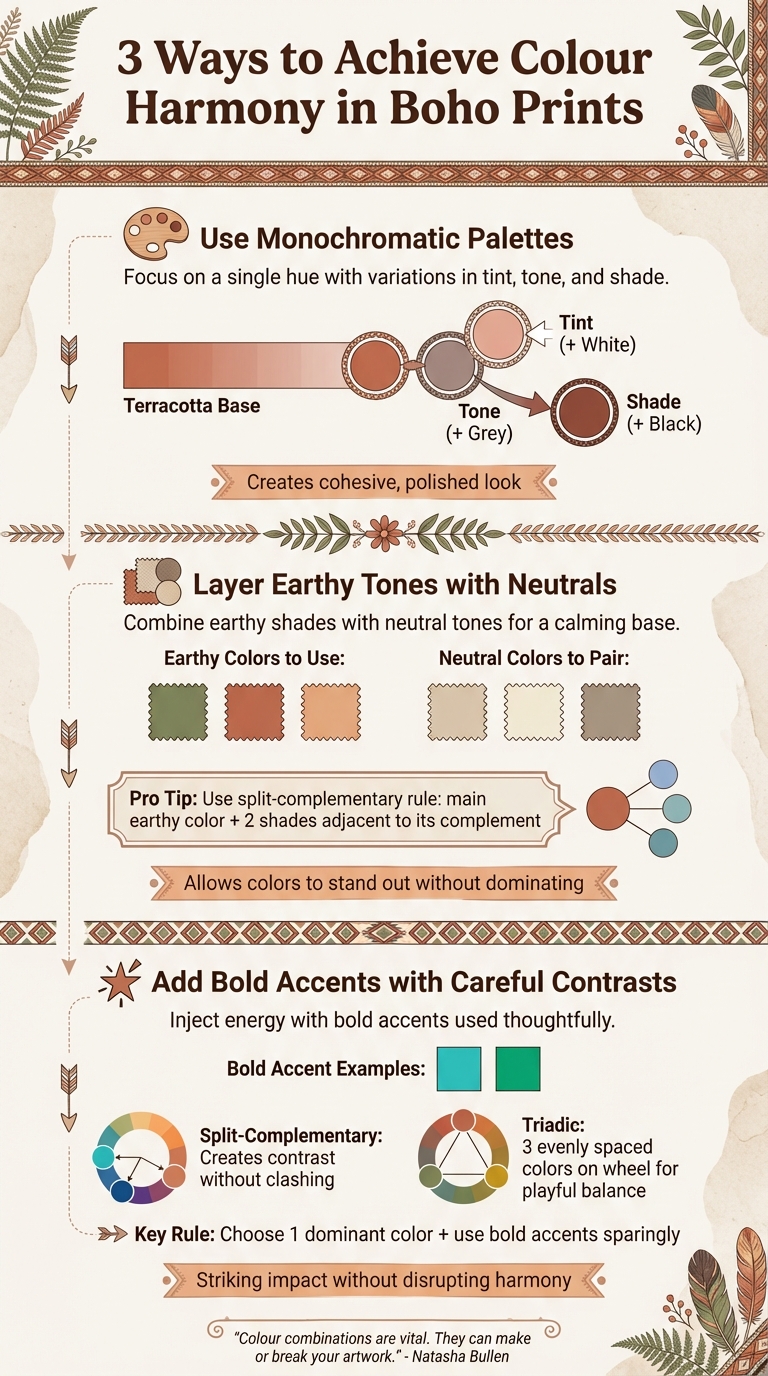
3 Techniques to Achieve Colour Harmony in Boho Prints
Creating harmony in boho prints can be tricky when dealing with multiple colours and patterns. Here are some practical techniques to maintain balance and avoid overwhelming designs.
Solution 1: Use Monochromatic Palettes
A monochromatic palette focuses on a single hue and its variations in tint, tone, and shade. This method simplifies complex bohemian patterns, highlighting their intricate textures and details without adding visual chaos. For instance, starting with a warm terracotta base, you can adjust its lightness or intensity by blending it with white for softer tints, grey for muted tones, or black for richer shades. The result is a cohesive and polished look.
"As they are created from the same colour, they naturally complement each other effortlessly. This is best used for single subjects as it forces you to concentrate on the detail of the artwork." – Natasha Bullen, Contrado
Whether you lean towards a soothing sage green or a vibrant burnt orange, a monochromatic approach ensures a clean and unified aesthetic. It's also a great foundation for introducing additional colours, as we'll explore in the next technique.
Solution 2: Layer Earthy Tones with Neutrals
Combine earthy shades like moss green, terracotta, or peach with neutral tones such as beige, ivory, or taupe to create a calming base. Neutrals act as a subtle backdrop, allowing the earthy colours to stand out without dominating the design. Interior design expert Elimar Lobo Sáenz often emphasises this balance for achieving an authentic boho vibe.
To add depth, include textured elements like macramé, woven fabrics, or natural wood. A popular technique is to apply an earthy tone across the design in varying shades, creating a layered effect through subtle contrasts. For a touch of vibrancy, try the split-complementary rule: choose your main earthy colour and pair it with two shades adjacent to its complementary colour on the colour wheel. This approach adds a lively but balanced contrast.
Solution 3: Add Bold Accents with Careful Contrasts
Bold accents, such as turquoise or emerald green, can inject energy into boho prints when used thoughtfully. A split-complementary colour scheme works well for creating contrast without clashing, while a triadic scheme - using three evenly spaced colours on the colour wheel - adds a playful yet balanced touch.
To keep the design cohesive, choose one dominant colour and use bold accents sparingly. When working with complementary colours, let the softer shade dominate and reserve the bolder hue for strategic highlights. This way, you can achieve a striking visual impact without disrupting the overall harmony of the print.
sbb-itb-78c8b21
How OMG Kitty Prints Deliver Colour Harmony

What Makes OMG Kitty's Boho Prints Different
OMG Kitty prints, designed in the UK, stand out for their carefully crafted colour palettes that make creating harmonious boho designs straightforward. Each print features toned colours, which strike a balance between being visually impactful and easy on the eyes. As colour theory experts explain:
"Toned colours... are seen as colours that are believed to be much easier to look at. They are perhaps 'stronger' and more sophisticated with a brighter appearance, being able to stand out amongst the crowd." – Hatchly
The design process embraces analogous colour schemes, where shades close to each other on the colour wheel are chosen. This ensures each print feels naturally cohesive without overwhelming the viewer. To add depth and softness, designers incorporate tints and shades, creating prints that are both visually engaging and balanced. Plus, every piece is made to order with sustainability in mind, aligning with the eco-conscious spirit of bohemian design.
How OMG Kitty Prints Make Colour Coordination Easy
OMG Kitty takes the guesswork out of colour coordination. With pre-matched palettes, mixing and matching prints becomes effortless, whether you're decorating a cosy corner or an expansive gallery wall. Available in sizes from A4 to A1, and with options for framed or unframed pieces, these prints fit seamlessly into any UK home.
The use of giclée printing ensures colours stay vivid and true to the original design, while the hand-designed approach guarantees attention to detail and harmony. This thoughtful process simplifies the challenge of boho decorating, allowing you to focus on creating a space that feels personal and inviting. Whether you're after a bold statement piece or a curated collection, OMG Kitty's designs make it easy to bring your vision to life.
Conclusion: Creating Better Boho Spaces with Colour Harmony
Bringing colour harmony into bohemian spaces can transform them from a jumble of styles into tranquil, unified environments. When colours flow together effortlessly, the room feels balanced and inviting, celebrating the eclectic nature of boho design without losing its sense of refinement. This creates spaces that are both vibrant and soothing, where earthy tones, neutral shades, and bold pops of colour coexist beautifully.
A carefully chosen colour palette does more than just look good - it shapes the mood and atmosphere of a room. Thoughtful bohemian design can evoke a range of emotions, from the calming effect of sage green to the cosy warmth of terracotta. These colours turn living areas, bedrooms, and even workspaces into sanctuaries that encourage relaxation and spark creativity. This balance of aesthetics and functionality makes colour harmony essential for practical and inspiring boho interiors.
To make this process easier, OMG Kitty offers hand-designed prints that take the guesswork out of creating a harmonious look. Each design features pre-matched palettes, carefully toned colours, and complementary schemes, allowing you to achieve a polished bohemian vibe effortlessly. With premium giclée printing, the colours stay vivid and true, while the variety of sizes ensures flexibility in your design.
The principles of colour harmony - whether through monochromatic schemes, earthy tones, or bold accents - are at the heart of successful bohemian design. They allow you to mix patterns, textures, and global influences without sacrificing the calm, grounded feel that defines boho interiors. By starting with thoughtfully crafted prints that prioritise harmony, you can create a space that’s not only visually stunning but also deeply comforting and uniquely yours.
FAQs
How can I create a harmonious colour palette for boho prints?
Achieving colour harmony in boho prints is all about creating a balanced and inviting look. Start with a base of earthy tones like terracotta, olive green, or ochre - these colours provide a soothing foundation. To keep everything balanced, try the 60-30-10 rule: allocate about 60% of your design to the base colour, 30% to a secondary shade, and the final 10% to a bold accent.
For accents, pick shades that work well with your base palette - think blush pink or burnt orange. A quick way to ensure harmony is by using the colour wheel. Analogous hues (colours next to each other on the wheel) or complementary ones (opposites on the wheel) tend to pair beautifully. If you're unsure, start small: experiment with cushions, throws, or rugs before committing to larger prints or wall designs. Always assess your choices in natural light to see how the colours interact in real-world settings. With these tips, you can craft a boho-inspired space that feels effortlessly cohesive and full of character.
How can I create colour harmony in boho-style designs?
Achieving a balanced colour scheme in boho-style designs begins with blending earthy tones like terracotta, olive green, ochre, and beige with vivid accents such as blush pink, burnt orange, or navy blue. One practical approach is the 60-30-10 rule: allocate 60% of the space to a dominant neutral shade, 30% to a complementary secondary hue, and the final 10% to a bold accent for contrast.
For a unified look, consider using colour-wheel theory to guide your choices. Opt for analogous colours (those sitting next to each other on the wheel) for a calm, flowing effect, or introduce complementary colours (those opposite each other) sparingly to create striking contrasts. To elevate the boho aesthetic, incorporate natural materials like wood and linen, and layer in patterns - geometric or botanical designs work particularly well. A thoughtfully chosen boho print can serve as the finishing touch, bringing cohesion and artistry to the space.
Why is colour harmony essential in boho prints?
Colour harmony is essential for capturing the relaxed yet lively vibe of boho prints. Combining earthy shades like terracotta, ochre, and taupe with vivid accents such as teal or coral creates a balanced and welcoming aesthetic.
This careful colour selection not only elevates the design's appeal but also ensures it works seamlessly across different interior styles, whether minimalist or eclectic. The outcome? A look that's effortlessly natural and refreshingly uplifting.