
Boho colour palettes celebrate freedom and individuality through a mix of earthy tones and vibrant accents. They combine warm neutrals like terracotta, cream, and sage green with bold pops of colour such as burnt orange, emerald, and mustard yellow. This style thrives on layering textures and colours to create inviting, personal spaces.
Key takeaways:
- Neutral base: Use earthy tones like beige, terracotta, or sage for walls and furniture.
- Accent colours: Add jewel tones (emerald, sapphire) or bright shades (fuchsia, turquoise) in smaller decor items.
- Textures: Incorporate natural materials like rattan, wood, and textiles for depth.
- Art prints: Match artwork to your palette for a cohesive look, focusing on earthy tones with vibrant highlights.
Boho design has no strict rules - it's about creating a space that reflects your personality using layered colours, textures, and decor.
BOHO DECOR & COLORS | BOHEMIAN INTERIOR DESIGN TIPS
sbb-itb-78c8b21
What Makes Up a Boho Colour Palette
A boho colour palette blends earthy tones with vibrant accents to create a harmonious yet dynamic aesthetic. The foundation lies in warm neutrals and natural shades like terracotta, rust, sage green, and sandy beige. These tones evoke a grounded, organic feel. Adding bright accents and jewel tones to this base injects energy and depth without overpowering the overall design.
This balance between earthy hues and bold pops of colour mirrors the natural world, which is at the heart of boho style. Understanding this interplay is essential for pairing colours effectively as we delve deeper into boho design principles.
Earth Tones and Warm Neutrals
Earth tones are the cornerstone of any boho palette. Shades like terracotta and rust bring warmth, while sage and olive green lend a calming, botanical vibe. Browns - ranging from deep chocolate to soft camel - anchor the space, providing a stable backdrop for more vibrant elements.
Warm neutrals, including beige, cream, and sand, act as a perfect canvas. They balance brighter tones and ensure the space feels open and uncluttered. As Natalie Ebel, Co-founder and Creative Director at Backdrop, notes:
"36 Hours in Marrakesh is a warm, earthy pink that perfectly captures the boho spirit. It's grounded and transportive with a richness that feels both inviting and versatile".
These neutrals also enhance natural light, creating a cosy, sunlit ambience that makes any boho-inspired space feel welcoming and serene.
Bright Accents and Jewel Tones
Jewel tones add a touch of elegance and richness to the boho aesthetic. Shades like emerald green, sapphire blue, ruby red, and deep purple bring a luxurious feel when used thoughtfully. These colours work best in smaller doses - think cushions, throws, or statement art pieces - where they can stand out without overwhelming the earthy base.
For a burst of energy, vibrant accents such as fuchsia, turquoise, and burnt orange come into play. Hannah Yeo, Senior Manager of Colour Marketing at Benjamin Moore, suggests:
"For a bolder, more expressive space, introduce unexpected pops of colour such as ochre, deep citrus greens, and charcoal grays".
The secret lies in moderation. These vivid shades should enhance the grounded tones, creating a visually balanced and inviting space that embodies the essence of boho design.
Common Boho Colour Combinations
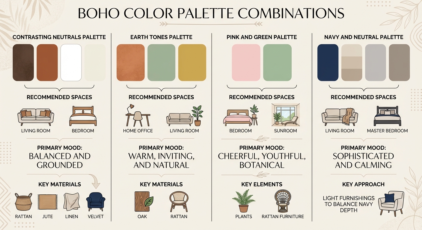
Boho Color Palette Combinations Guide with Room Recommendations
Boho design is all about blending earthy tones with vibrant accents, creating spaces that feel both grounded and eclectic. Below, we’ll dive into four popular colour combinations that beautifully capture the bohemian spirit. Each palette brings its own mood and character, while staying true to the free-spirited essence of boho style.
Contrasting Neutrals Palette
This palette strikes a balance between warmth and lightness, making it a classic choice for boho interiors. Deep browns or rust tones paired with whites and creams create a high-contrast look that feels both cosy and airy. It’s ideal for living rooms and bedrooms, where the rich browns add depth while the lighter shades keep the space open and inviting. For example, deep brown furniture set against a cream backdrop can create a cocooning effect without overwhelming the room.
As Natalie Ebel from Backdrop explains:
"In spite of its earthy pink tone, it can also act as a warm neutral, making it an ideal backdrop for layering textures, patterns, and personal touches".
To enhance this look, layer in textured materials like rattan, jute, linen, or velvet. These elements add richness without relying on bold colours.
Earth Tones Palette
For a warm, organic vibe, this trio of terracotta, sage green, and mustard yellow is a perfect fit. Terracotta brings the warmth of sun-baked clay, sage green offers a calming botanical touch, and mustard yellow injects a lively energy. Together, they create a harmonious and inviting scheme.
This combination works well in spaces like living rooms and bedrooms. Terracotta can make a living area feel cosy, while sage green’s muted tones are perfect for restful bedrooms. Mustard yellow, on the other hand, is great for accent pieces like cushions or artwork. Natalie Ebel highlights the appeal of terracotta:
"adds depth and warmth to any space, making it an ideal relaxed atmosphere".
Pair these colours with natural materials such as oak or rattan to amplify the grounded, earthy feel.
Pink and Green Palette
For a playful, botanical twist, pair soft pink with sage green. Sage acts as a versatile neutral that ties different elements together, while pink adds a cheerful, lighthearted touch. This palette works particularly well in sunrooms, bedrooms, or spaces filled with plants and rattan furniture.
Hannah Yeo from Benjamin Moore notes:
"like the stem of the flower, a silvery sage seamlessly connects a wide range of colours".
Use sage as the dominant base, and bring in pink through textiles, artwork, or painted furniture. To complete the look, add plenty of greenery - potted plants help bridge the gap between the pink accents and green base, creating a cohesive, nature-inspired atmosphere.
Navy and Neutral Palette
If you’re after a more refined, modern boho feel, try combining deep navy with warm neutrals and soft greys. Navy adds depth and a sense of calm, making it a great choice for living rooms or master bedrooms. Pair it with light furnishings - such as a grey sofa or taupe rugs - to prevent the space from feeling heavy.
This palette creates a rich, layered look, with navy acting as a bold anchor while neutrals keep the overall feel light and breathable. The result is a sophisticated take on boho style that feels both elegant and approachable.
| Palette Combination | Recommended Spaces | Primary Mood |
|---|---|---|
| Contrasting Neutrals | Living Room, Bedroom | Balanced and grounded |
| Earth Tones | Home Office, Living Room | Warm, inviting, and natural |
| Pink and Green | Bedroom, Sunroom | Cheerful, youthful, botanical |
| Navy and Neutral | Living Room, Master Bedroom | Sophisticated and calming |
How to Pair and Balance Boho Colours
Creating a balanced boho aesthetic involves layering colours, textures, and accents in a way that feels intentional rather than chaotic. The goal is to maintain a free-spirited vibe while achieving a cohesive design.
Start with a Neutral Base
The first step is to establish a neutral foundation. Opt for earthy tones like creamy whites, warm beiges, or soft terracotta on walls and larger furniture pieces. These subtle shades act as a blank canvas, making it easier to layer bolder accents without overwhelming the room. As Emma Taggart from Linearity notes:
"Start with a neutral base as your foundation, then layer warm and cool tones to build depth and add visual interest."
Once your base is set, introduce secondary colours through rugs, curtains, or chairs. Mustard yellow, burnt orange, and jewel tones are excellent choices to bridge the gap between the neutral backdrop and more vibrant accents. Save the brightest colours - like turquoise, magenta, or lime green - for smaller decorative elements such as cushions or artwork. Alan George, Founder of Edward George London, advises:
"While boho style embraces colour, using too many vibrant colours without enough neutral space can create a cluttered feel. Balance is key."
A helpful guideline is to stick to one dominant base colour and two or three complementary accents. Pairing warm shades like peach or mustard with cooler tones like deep teal can create a striking yet harmonious contrast.
Add Metallics for Texture
Metallic accents can elevate a boho colour scheme by adding texture and a touch of luxury. Gold, brass, and copper are particularly effective in this style. Use them in lighting fixtures, picture frames, or cabinet hardware to introduce shine without overpowering the space. For instance, brass paired with forest green or copper alongside terracotta can lend a sophisticated edge.
Keep metallics subtle. A bold brass pendant light can anchor the room, while smaller details, like vases or drawer pulls, can add a gentle sparkle throughout.
Use Textiles and Furniture
Textiles are an easy way to add both colour and texture without making permanent changes. Experiment with layers of fabric - velvet cushions, linen throws, and macramé wall hangings - to create depth and visual interest. For example, placing a patterned kilim rug over a neutral jute rug can inject personality into the space without overwhelming it.
Furniture made from natural materials like rattan, rustic wood, or leather complements the softness of textiles while grounding your colour scheme. These materials also enhance the connection to nature that’s central to boho style. Combining sturdy wood or metallic fixtures with soft elements like gauzy curtains or chunky knit throws adds a tactile richness to the room.
| Element Type | Recommended Materials | Purpose in Boho Harmony |
|---|---|---|
| Neutral Base | Off-white, taupe, warm beige, terracotta | Provides a clean, adaptable backdrop |
| Textiles | Velvet, jute, linen, macramé | Adds softness and introduces secondary colours |
| Furniture | Rattan, rustic wood, leather | Grounds the space with natural, earthy elements |
| Metallics | Gold, brass, copper | Brings warmth and a touch of elegance |
Using Boho Palettes with Art Prints
Art prints are a fantastic way to bring boho colour palettes into your home while adding character and harmony to your space. The right artwork can effortlessly blend earthy tones, jewel-like accents, and neutral hues, creating a cohesive and inviting aesthetic.
Choosing Prints to Match Your Palette
When picking art prints, focus on designs that reflect the main earthy tones of your room, complemented by rich secondary colours and vibrant accents. Alan George, Founder of Edward George London, shares:
"Use artwork and decor pieces in a mix of earthy tones, saturated hues, and vibrant accents to add interest and depth."
Start by identifying the dominant colours in your room. For example, if your space features warm beige and terracotta, look for prints that incorporate shades like botanical green, burnt orange, or sunset-inspired hues. OMG Kitty offers a boho-style collection with hand-designed prints in classic boho tones like sage green, mustard, teal, and emerald - making it easy to find pieces that align with your palette.
It’s also a good idea to test your chosen prints under different lighting conditions. A deep navy print, for instance, might appear rich and dramatic under lamplight but may seem too dark in dim corners. To maintain balance, mix bold, pattern-heavy designs with simpler, minimalist ones to avoid overwhelming the space. As Hemming & Wills explains:
"A white-painted wall enables your boho furniture and accessories to breathe, emphasising their patterns and colours."
Once you’ve found the perfect prints, consider their quality and how they align with sustainable decor practices.
Quality and Sustainability in Art Prints
Sustainability is becoming increasingly important in boho-inspired interiors, with many opting for decor that reflects eco-conscious values. OMG Kitty embraces this principle through its made-to-order production approach, which minimises waste by creating prints only when they’re ordered. This thoughtful process resonates with the natural, free-spirited essence of boho design.
All prints are hand-designed in the UK and come in a variety of sizes, from A4 to A1. This flexibility allows you to decorate anything from a large feature wall to a cosy gallery corner. Using Giclée printing technology ensures vibrant, true-to-design colours. You can choose between framed options for ready-to-hang convenience or unframed prints, giving you the freedom to select frames that match your style - perhaps metallic ones in gold, silver, or bronze for a subtle shimmer.
With prices starting at £24.00, refreshing your space seasonally or experimenting with new colour combinations is both affordable and straightforward. Plus, worldwide tracked shipping ensures your order arrives safely, no matter where you are.
Arranging Wall Art for Balance
Once your art prints are ready, how you arrange them plays a crucial role in achieving that relaxed yet curated boho vibe. Layering different print sizes and textures creates visual interest. For example, combine an A1 statement piece with a cluster of smaller A4 prints. Mixing framed and unframed pieces adds to the eclectic charm .
To maintain harmony, ensure the pieces share one or two common colours. If your palette revolves around terracotta and sage green, choose prints that incorporate these shades at varying intensities. This approach keeps the arrangement cohesive without feeling repetitive.
Don’t stop at prints - add natural elements like macramé wall hangings or indoor plants to enhance the boho aesthetic. Place your largest, boldest print at eye level to anchor the display, then build outwards with smaller pieces, leaving relaxed spacing between frames for an effortless, layered look.
Conclusion
Boho colour palettes are a wonderful way to reflect your personality and mood. Whether you lean towards warm desert shades, lush botanical greens, or deep, vibrant accents, the charm of boho design lies in its boundless creativity. As Lick aptly says:
"When it comes to boho decor, the rules are there are no rules."
To create harmony, start with a neutral base - think warm beige, creamy whites, or soft terracotta - and layer 2–3 complementary colours following the 60-30-10 rule. It’s also important to test your colour choices under various lighting conditions, as boho tones can appear different depending on whether the light is natural or artificial. This thoughtful approach ensures your space is ready for standout pieces, like statement art.
Art prints, in particular, can bring your colour scheme together beautifully. They act as focal points, seamlessly blending your primary, secondary, and accent colours. OMG Kitty's boho-inspired collection features hand-designed prints in timeless hues like sage green, mustard, teal, and emerald. Starting at just £24.00 and available in sizes from A4 to A1, these prints offer an affordable and eco-friendly way to update your decor while showcasing your free-spirited style.
FAQs
How can I select the perfect accent colours for a boho-inspired space?
To pick the ideal accent colours for a boho-inspired space, begin with a base of earthy tones such as terracotta, olive green, ochre, or warm beige. Once the foundation is set, add one or two accent colours to inject personality without overwhelming the room. Subtle shades like blush pink, burnt orange, or deep navy complement the earthy palette beautifully, while cooler tones like teal or mallard green can provide a striking contrast to warmer hues like mustard or peach.
Consider the vibe you want to achieve. For a serene living room, soft blush pink accents in cushions or wall art can bring a light and uplifting touch. On the other hand, burnt orange rugs or navy-blue prints can add a cosy richness to a bedroom. Start small with accents like throws, pillows, or artwork, and tweak the colours as needed to keep the space balanced. Sticking to two or three accent colours helps maintain a cohesive and harmonious look.
Don’t forget to test your chosen colours in the room’s lighting. Natural daylight and warm artificial light can dramatically alter how colours appear. Once you find a combination that works well, you can expand with larger pieces, such as a boho-style art print, to pull the look together and create a warm, inviting atmosphere.
How can I balance textures in boho-style interiors?
Balancing textures is a cornerstone of crafting a boho aesthetic that feels cosy without becoming chaotic. Begin with a neutral foundation - imagine a soft beige wall or a light-toned rug - and build upon it by layering contrasting materials. Smooth ceramics paired with rougher textures like woven jute or rattan create depth while maintaining a unified look.
To keep the space visually interesting, vary the scales and patterns in your decor. For instance, a chunky rattan chair can be complemented by finer details such as embroidered cushions or a macramé wall hanging. Bringing in natural elements, like potted plants or woven baskets, adds even more texture without making the room feel overdone.
Stick to an earthy, muted colour palette - think warm neutrals, soft terracotta, or sage green - to allow the textures to take centre stage. By carefully blending materials and finishes, you can create a boho-inspired space that feels relaxed, inviting, and perfectly put together.
How can I use art prints to complement a boho colour palette?
Art prints can be a brilliant way to bring a boho colour scheme to life. Think earthy shades like terracotta, olive green, ochre, and beige, paired with vibrant touches of blush pink, burnt orange, or navy blue. To keep things visually balanced, try the 60-30-10 rule: let neutral tones take up 60% of the space (think walls or a large rug), use complementary mid-sized prints for 30%, and reserve the final 10% for bold, eye-catching details in smaller prints or accessories.
For that laid-back boho aesthetic, go for prints with botanical, tribal, or abstract designs. Pair them with natural frames - reclaimed wood or bamboo are great choices - to keep the organic, relaxed vibe intact. Larger prints, like A1, make a statement above a sofa or on a feature wall. Meanwhile, smaller prints (A4–A3) can be arranged together to create a striking gallery wall.
Art prints also offer a subtle way to add colour to neutral spaces. Picture a terracotta-toned print paired with olive-green cushions, or a navy-accented botanical design alongside a beige rug. These combinations add depth and a sense of harmony. With plenty of sustainably made, hand-designed options available in the UK, it’s easy to refresh your home in a way that’s both stylish and eco-conscious - without breaking the bank.