
Boho prints are an excellent choice for creating statement walls that add warmth and personality to your home. With their earthy tones, nature-inspired motifs, and rich textures, they can transform plain walls into eye-catching focal points. Here’s a quick guide to styling them:
- Boho Prints: Typically feature organic shapes, botanical patterns, celestial symbols, and global influences like Moroccan tiles or Indian mandalas. Colours range from terracotta and sage green to jewel tones like emerald or burgundy.
- Why Choose Boho Prints? They blend well with various interior styles - modern, rustic, or minimalist - and bring depth and character to any space.
-
Key Tips:
- Select prints that complement your room’s existing colours and textures.
- Use larger prints (A2 or A1) as focal points, and smaller ones for gallery-style arrangements.
- Follow the 2/3 rule: Art should cover two-thirds to three-quarters of the wall space above furniture.
- Include natural materials like wooden frames, macramé hangings, or woven baskets for added texture.
- Ensure enough negative space between pieces to prevent clutter.
For 2025, the trend leans towards softer palettes like clay pink and desert taupe, paired with clean, abstract designs. Whether you prefer bold centrepieces or subtle accents, boho prints offer endless possibilities for creating a welcoming and artistic atmosphere.
How to Create a Boho Statement Wall: Step-by-Step Guide
Inspiring Boho Wall Decor Ideas. Bohemian Style Wall Design.
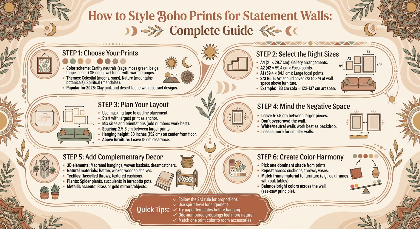
Choosing the Right Boho Prints for Your Space
When picking boho prints for your home, start by considering your room's existing vibe and colour palette. A well-designed statement wall doesn’t happen by accident - every piece should blend seamlessly with the room's mood and colours.
Anchor your choices around a cohesive colour scheme. For tranquil spaces, earthy neutrals like sage, moss green, beige, taupe, and peach create a calming base. If you're after a more dynamic feel, rich jewel tones paired with warm oranges bring that lively, eclectic boho energy to life. Interior design expert Elimar Lobo Sáenz explains, "Generally speaking, Bohemian style interiors typically incorporate lots of different textures, attractive patterns and colors while also putting high emphasis on natural materials and comfort as a whole". Look for prints that echo the textures and tones already present in your furniture and decor.
Size matters too. Avoid art that's too small - it can get lost on the wall. Larger formats like A2 (42 × 59.4 cm) or A1 (59.4 × 84.1 cm) make excellent focal points, while smaller A4 (21 × 29.7 cm) prints work best grouped in a gallery-style arrangement. A handy tip: follow the 2/3 rule - art should cover between two-thirds and three-quarters of the wall space above furniture. For example, if your sofa is 183 cm wide, aim for art spanning 122–137 cm. Getting the proportions right is key to creating a striking statement wall.
Selecting Core Pieces from OMG Kitty's Collection

OMG Kitty offers a stunning range of hand-designed boho prints that balance current trends with timeless appeal. Each print is sustainably made to order in Birmingham using premium giclée printing on 210gsm fine art poster paper, ensuring vibrant colours and lasting quality. With over 200 five-star reviews highlighting the "excellent paper and print quality" and "beautiful designs", this collection is a solid starting point for your boho-inspired wall.
The collection features celestial designs like "The Sun Will Rise", "Summer Moon", and "Stargazer", alongside nature-inspired pieces such as "The Mountain", "On The River", and "Eucalypt Forest". For softer, organic vibes, botanical prints showcasing Australian flora - like eucalypt flowers, wattles, and banksias - add a gentle touch, as does the "Daydreamer" print with its floral-filled silhouettes. Prices start at £24.00 for A4 sizes, with A3 from around £34.00 and A2 from £45.00.
You can choose framed or unframed prints. Frames come in 22mm wide wooden styles - oak for warmth, or white and black for a more modern boho feel. Unframed prints are perfect for minimalist spaces and allow flexibility for future redecorations. With worldwide tracked delivery, building your collection over time is hassle-free.
Once you’ve picked your core pieces, focus on tying them together through colour and theme.
Matching Colours and Themes
To create a cohesive look, ensure your prints share a unified colour scheme. Consistency in colour can bring harmony to even the most diverse patterns. You can confidently mix geometric shapes, florals, and abstract designs, as long as the colours complement each other. A colour wheel can be a helpful tool to identify shades that work well with your existing decor - this prevents clashing and ensures everything feels balanced.
Modern boho designs often favour earthy, muted tones like terracotta, ochre, rust, peach, and sage green. A popular trend for 2025 involves choosing one dominant shade from your prints and repeating it across accessories like cushions, throws, and vases for a cohesive "washed" effect. This monochromatic approach feels fresh while staying true to boho's relaxed charm.
If your walls are painted in darker hues, opt for prints with bold or high-contrast colours to keep them from blending into the background.
Nature and spiritual themes remain popular for creating grounded, serene living spaces. Mandalas, for instance, symbolise spiritual guidance, while prints featuring mountains, suns, and moons establish a connection to the natural world. When choosing themes, think about the purpose of the room: calming botanical designs work well in bedrooms, while bold celestial or animal imagery (tigers and cats are especially trendy) can energise living areas.
To avoid mistakes, try the masking tape trick: outline your intended print sizes on the wall using tape to visualise how they'll look without committing to nails or hooks. This simple step helps you get the scale and placement just right. And with boho style ranking as the third most popular interior design trend according to Architectural Digest, you'll find plenty of inspiration to guide your choices.
Planning and Arranging Your Statement Wall
Once you've selected your favourite prints from OMG Kitty's collection, the next step is deciding how to display them. Thoughtful planning is essential, especially if you want to avoid unnecessary damage to your walls. A great way to start is by laying your prints on the floor and experimenting with different layouts until you find one that feels balanced and visually engaging.
For a more eclectic style, begin with your largest print as the anchor and build around it using smaller pieces. If precision is more your style, try the paper template method. Simply trace the outline of each frame onto paper, cut out the shapes, and tape them to the wall with low-tack tape. This lets you visualise your layout before committing. If you're using new frames, the paper sheets inside can double as ready-made templates.
Mixing various sizes and orientations can add a dynamic touch to your arrangement. Odd-numbered groupings often feel more balanced and natural. For more guidance on combining sizes and frame orientations, check out the gallery wall layout section below.
"I love having a nice variation of some more abstract prints and some quotes and writing, which I think is why the two prints in my collection look great together." - Zoe Sugg, Interior Designer
The choice of frames can also influence the overall vibe of your wall. Natural wood frames offer a sense of warmth, black gallery frames bring a modern edge, and gold accents add a touch of elegance. To enhance the boho aesthetic, consider adding 3D elements like macrame hangings, woven baskets, or sun mirrors. These layers of texture and depth are what give boho walls their signature charm.
Now that you’ve got your prints and framing sorted, let’s dive into creating a gallery wall layout that’s both precise and stylish.
Creating a Gallery Wall Layout
A tried-and-true rule for hanging artwork is the "60 inches on centre" guideline - this means the centre of your artwork or grouping should sit roughly 152 cm from the floor, making it perfect for eye-level viewing. If you're placing art above furniture, like a sofa or bed, leave at least 15 cm of clearance to keep everything proportionate.
When it comes to spacing, aim for gaps of 2.5 to 6 cm between larger prints. This keeps the arrangement cohesive without feeling overcrowded. For smaller pieces, tighter gaps - less than the width of the frames - can create a cosy, intentional look. Using a spirit level is a smart way to keep everything aligned.
If you’re renting or simply don’t want to drill holes, adhesive picture strips (like Command Strips) are a great, damage-free option for lighter frames. For heavier pieces, wall anchors or screws are your best bet to ensure stability.
Balance is everything. Placing the largest piece on the left side of your grouping often feels more natural because it aligns with the way our eyes move across a space. Arrange the remaining prints around this focal point, mixing different frame styles and orientations to achieve that effortlessly eclectic boho vibe.
Once your layout is set, think about how negative space can elevate your design even further.
Using Negative Space
One common mistake when designing a statement wall is trying to fill every inch of space. Negative space - those blank areas around your art - gives each piece room to breathe, preventing the wall from looking cluttered.
"Give the artwork plenty of space to breathe, and don't overcrowd the wall." - Patricia Barrett Studio
This is especially important for boho prints, which often feature intricate patterns and bold colours. Without enough spacing, the designs can clash and lose their impact. Aim for at least 5–7.5 cm between larger pieces to maintain clarity and balance.
Think of negative space as an essential part of the design, not as wasted wall area. White or neutral walls work particularly well as backdrops for boho statement walls, allowing the vibrant and eclectic prints to take centre stage.
"I always pay close attention to the natural light in the space and choose textural elements and wall art that complement and enhance it." - Lauren Nelson, Interior Decorator
If you're working with a smaller wall, resist the temptation to overcrowd it. Sometimes a single oversized piece or a carefully chosen trio can make a stronger visual statement than a packed gallery. Step back frequently to assess the overall balance and adjust as needed.
sbb-itb-78c8b21
Adding Complementary Decor to Enhance Boho Style
Once you've arranged your gallery wall, you can take it to the next level by incorporating decor that complements the boho aesthetic. A statement wall becomes even more striking when you layer it with textures and natural elements that reflect the carefree, artistic vibe of boho design.
Soft furnishings such as tasselled throws, textured cushions, and vintage rugs can infuse your space with a cosy, relaxed feel that perfectly complements the free-spirited essence of your wall art. To add dimension, consider 3D elements like macramé wall hangings, woven baskets, or ceramic planters. These pieces work beautifully alongside framed prints, creating a harmonious blend of textures and styles.
Natural materials play a key role in achieving the boho look. Think rattan furniture, wicker storage baskets, and wooden shelves - all of which provide a warm, organic counterpoint to the bold lines of your artwork. Terracotta pots and dried grasses in curvy vases are excellent low-maintenance additions that bring an earthy charm. If you have a sideboard or shelf beneath your gallery wall, try stacking a few books and adding dried botanicals to visually connect your prints with the rest of the room.
Adding Textures and Layers
To create depth and interest, incorporate tactile, three-dimensional pieces like air plant holders, dreamcatchers, or woven baskets. Macramé, whether in the form of wall hangings or plant holders, is a timeless boho staple that adds texture and charm. Popularised in the 1970s, macramé remains a go-to for its handcrafted appeal and versatility.
For an eclectic, layered look, mix materials like crocheted curtains, yarn art, or embroidery. You could even hang embroidered or beaded fabric panels as an alternative - or complement - to framed prints. These handcrafted elements echo the artisanal quality and eclectic energy of OMG Kitty's boho art prints. If you're renting and want to avoid damaging your walls, adhesive picture strips are a practical solution for lightweight decor.
To keep your gallery wall cohesive, focus on a consistent colour palette across your prints and layered textiles. For example, sticking to neutral tones like black, white, and beige can help balance the overall look. Odd-numbered groupings - such as three macramé hangings or five baskets - tend to feel more intentional and visually pleasing.
Choosing Furniture and Accessories
The furniture and accessories you choose can tie the entire room together, amplifying the boho vibe of your wall. Light-toned wooden or rattan furniture works beautifully to maintain a relaxed, natural feel, while a darker wood piece or two can add contrast and depth.
"What makes Boho special is its layered mix of textures from seagrass and rattan to raffia and wood. On your walls, Boho decor becomes more than just decoration; it's a way to create a 'story'." - Artera Home
Metallic accents in brass or gold - whether in mirror frames, decorative objects, or small ornaments - add a touch of elegance and serve as focal points against the earthy tones of your prints. Pair these with terracotta planters or amber glass vases to highlight the warm, autumnal hues often found in boho design.
Indoor plants are a must-have for achieving the boho look. Spider plants, weeping figs, or succulents bring a rustic, natural element to your space. Using macramé plant hangers, you can even incorporate greenery directly into your gallery wall, creating a lush, biophilic effect. Finally, multiple light sources - such as lanterns, candles, and floor lamps - help establish a cosy, inviting atmosphere, offering a softer alternative to overhead lighting.
Integrating Prints with Your Room's Decor
A statement wall works best when it complements your room's overall design, connecting boho prints with the surrounding furniture and decor. As interior designer Julia Kendell explains: "There's no doubt there should be some commonality in your colour scheme and general mood, but buying art to fit the pre-existing room can look very contrived. It's about finding a good link to the overall styling of a room."
Here’s how you can harmonise your prints with your existing decor and adjust them to fit any room size.
Matching Colours with Room Furnishings
Take your colour-matching skills up a notch by reflecting the hues in your prints across your furniture and accessories. Pick out a standout colour from your boho prints - like terracotta, mustard, or teal - and weave it into your room through cushions, throws, or rugs. This repetition creates a unified look that ties everything together.
"It's key to draw the eye around the space, and adding a pop of the same colour on a sofa as you have in a picture can help to make the whole room look cohesive." - Julia Kendell
If you’re working with a gallery wall, think strategically about colour placement. Home-design stylist Wil Law from John Lewis suggests: "If you have a really bright blue in the bottom left corner of your gallery wall, try to balance it with the same colour in the top right corner. Think of it like a see-saw." For added harmony, match the material of your frames to your furniture - oak frames, for instance, pair beautifully with oak tables or shelves, creating a subtle yet cohesive vibe.
Adapting to Different Room Sizes
The size of your prints should be in proportion to your space. In smaller flats, opt for one or two large anchor prints (A2 or larger) and arrange smaller pieces vertically to draw the eye upward. Antonia from Tidylife highlights: "A small print can look a bit lost on an empty wall, but would be perfect as part of a gallery wall."
For larger rooms, make a bold statement by placing oversized prints (A2 or larger) at the centre of your design. Pair these with low-profile furniture featuring exposed legs to maintain an open and airy feel. If your room has an unusual shape, experiment by offsetting prints to one side and balancing them with a tall plant or lamp for a visually dynamic effect.
Conclusion
Styling boho prints for a statement wall is all about creating harmony. Begin by choosing prints in earthy tones such as sage green and terracotta, or opt for moody jewel shades like burgundy and emerald. Pair these with natural textures - think macramé, velvet, or wood - to add depth and character. Use larger prints (A2 or bigger) as centrepieces, and complement them with smaller prints arranged in a gallery-style layout for visual interest.
Consistency is key. Match frames and repeat key colours throughout the room to tie everything together. These thoughtful touches ensure your wall reflects both your aesthetic and personality.
"To be bohemian is to live an unburdened, unconventional lifestyle... celebrating the joys of creativity, love, and freedom." - Patricia Barrett Studio
A well-designed statement wall isn’t just decorative - it transforms your space into a welcoming and tranquil retreat that mirrors your individuality. Nature-inspired boho prints, particularly those featuring celestial themes like moons and suns, can uplift your mood and encourage relaxation.
Ready to bring your vision to life? Check out OMG Kitty's collection of premium, sustainably crafted UK-designed giclée prints. Starting at just £24.00, they’re available in sizes from A4 to A1, framed or unframed, with worldwide tracked delivery.
FAQs
How do I pick the perfect size for boho prints on my wall?
Choosing the right size for boho prints is key to achieving a balanced and impactful look for your wall art. Start by measuring the width of your wall or the furniture below it in centimetres. A handy guideline is to pick artwork that spans about 60–75% of the available width - this keeps the print looking proportional and visually appealing.
Here’s an example: if your sofa is 180 cm wide, choose a print that’s between 120–135 cm wide. OMG Kitty offers a variety of sizes to suit different needs:
- A4 (21 × 30 cm) – Works well for narrow spaces or as part of a gallery wall
- A3 (30 × 42 cm) – A good choice for smaller walls or standalone pieces
- A2 (42 × 59 cm) – Looks great above a bedside table or a small sofa
- A1 (59 × 84 cm) – Ideal for larger sofas or open-plan areas
To get a sense of how the print will fit, try using masking tape or paper cut to the dimensions of the artwork and place it on your wall. Larger rooms often benefit from bigger prints to create a bold statement, while smaller spaces are better suited to more compact options. All OMG Kitty prints are sustainably produced in the UK and come framed or unframed, so you can tailor them to match your boho aesthetic effortlessly.
How can I match boho prints with my current room décor?
To effortlessly blend boho prints into your existing décor, pay attention to colour balance, textures, and placement. Start by identifying the dominant colours in your room and apply the 60-30-10 rule: dedicate 60% of the space to a base colour (like soft beige or warm terracotta), 30% to a complementary tone, and 10% to a bold accent, such as mustard or teal. For instance, if your sofa is a warm grey, look for prints featuring similar shades and add accents that tie in with your cushions, rugs, or lamps.
Think about the materials and patterns already in your space. Botanical and celestial designs work wonderfully with natural elements like houseplants, woven baskets, or textured blankets. If your room leans towards minimalism, layering smaller prints can create a gallery-like effect. For more visually active spaces, stick to a single standout piece. Wooden frames can enhance natural furniture, while metallic frames provide contrast against metal finishes. Hang prints at eye level and maintain about 5 cm of spacing between frames to achieve a balanced, polished look.
For added versatility, opt for prints that come in multiple sizes (A4 to A1) and finishes, whether framed or unframed, so you can tailor them to your space and personal style.
How can I add natural touches to a boho-style statement wall?
Creating a boho statement wall with a natural twist means combining organic materials with artistic charm. Start by selecting art prints that showcase botanical themes, earthy shades, or abstract landscapes reminiscent of the outdoors. To amplify the natural feel, go for frames crafted from reclaimed wood, bamboo, or other eco-friendly materials.
Add depth and texture by including woven rattan shelves or macramé wall hangings made from natural fibres. Complement these with small potted plants, cascading greenery, or even driftwood to bring a touch of the outdoors into your space. For a harmonious look, stick to warm tones like terracotta and beige, adding a few bold accents for contrast. Choosing sustainably made pieces, such as prints designed in the UK, adds an eco-conscious touch to your decor.
By blending nature-inspired artwork, live plants, and handcrafted elements, you’ll create a statement wall that feels earthy, vibrant, and effortlessly boho.