
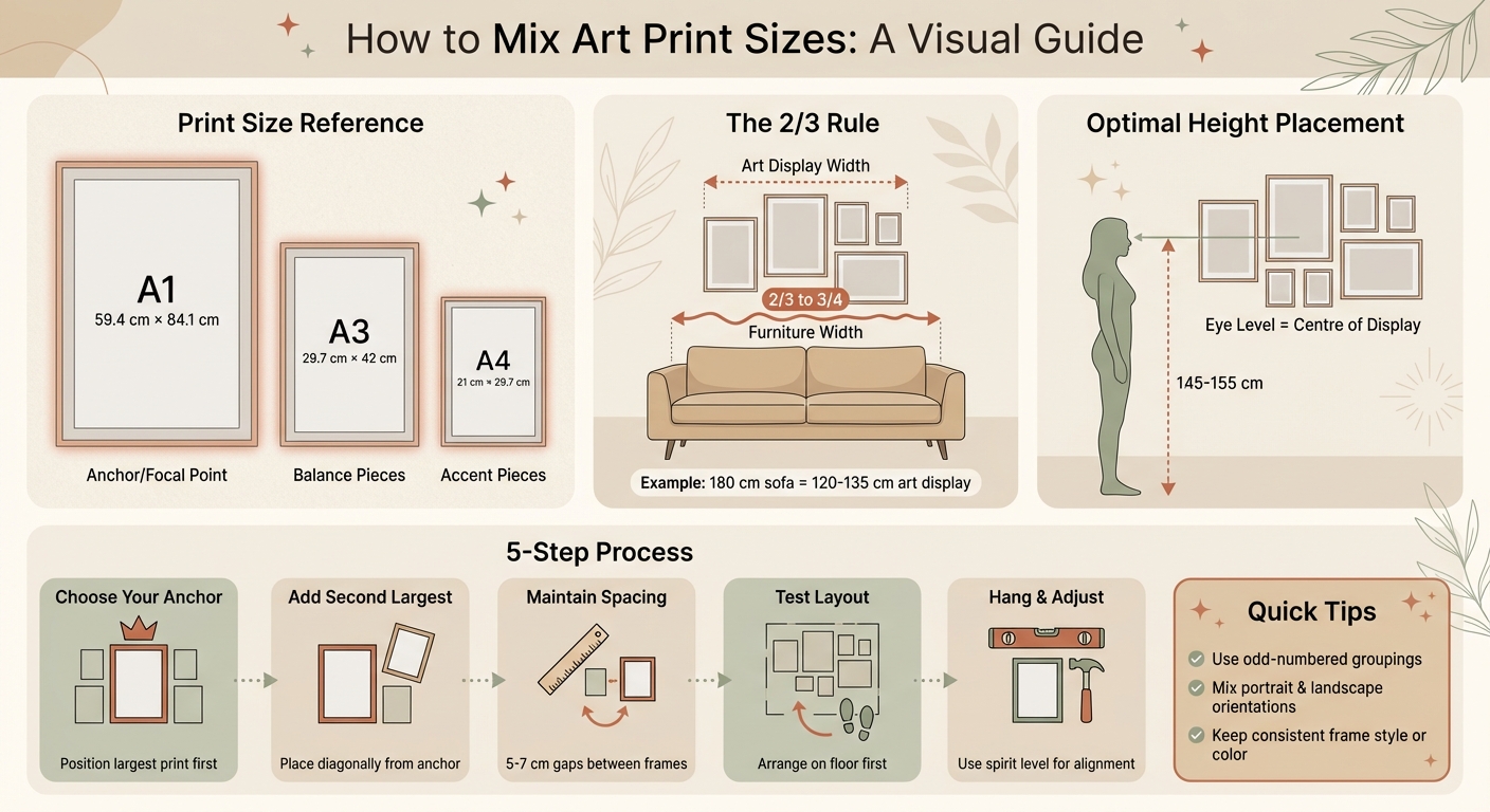
Layering art prints in different sizes can transform a plain wall into a striking display. The key is to combine larger, focal pieces with smaller accents to create balance, depth, and movement. Start with a central anchor print - ideally the largest - then arrange smaller prints around it. Use consistent spacing (about 5–7 cm) and follow the 2/3 rule: your art should cover two-thirds to three-quarters of the wall space above furniture.
Quick Tips:
- Anchor with a large print: Position it at eye level (145–155 cm from the floor).
- Mix sizes thoughtfully: Combine A1, A3, and A4 prints for variety.
- Plan your layout: Arrange prints on the floor or use paper templates before hanging.
- Maintain balance: Use consistent gaps and ensure the display spans two-thirds of the furniture width.
For a flexible approach, try overlapping prints on shelves or mantels. This adds depth without leaving nail holes. To tie the arrangement together, focus on shared colours or themes and consider uniform frames. By following these steps, you can create a visually engaging and personal display.
Step-by-Step Guide to Mixing Art Print Sizes on Your Wall
Layer up your mantle art! Here's the simple formula for a polished look
Why Mixing Sizes Improves Your Art Display
Blending prints of different sizes brings energy and character to your walls. While a row of identical frames might look tidy, it often lacks warmth and personality. Introducing variation in dimensions creates a more inviting and visually interesting display.
One of the secrets to achieving this is establishing a visual hierarchy. A larger print - say, around 60 cm × 80 cm - can act as a focal point, anchoring the arrangement. Smaller prints then complement it, helping to balance the overall composition. As Society6 explains:
A massive art piece can dominate a space, making everything else feel like they have less visual weight. The solution? Balance!
The Role of Visual Balance
Balance doesn’t mean everything has to be perfectly symmetrical. In fact, asymmetry often feels more natural and personal than strict, grid-like layouts. Start with your largest piece, placing it either centrally or slightly off-centre, and arrange smaller prints around it to distribute the visual weight. A helpful guideline is the 2/3 rule: aim for your art grouping to cover about two-thirds to three-quarters of the wall space above furniture like a sofa or sideboard. To keep things cohesive, maintain consistent spacing between frames - typically around 5 to 7 cm.
Creating Depth with Layers
Combining prints of varying sizes adds depth and dimension to your display, turning a flat wall into something truly dynamic. For example, you could overlap a smaller frame slightly in front of a larger one or hang pieces at different heights. This staggered arrangement creates a sense of movement, drawing the eye across the entire display. Positioning your second-largest piece diagonally from the main anchor further enhances this effect, making the wall feel lively and engaging rather than static. Up next, we’ll dive into practical tips for choosing the right sizes and styles to suit your space.
Selecting Art Prints: Size and Style Considerations
Once you've got a good handle on visual balance, it's time to pick prints that work well together. The trick is to find a mix of sizes, styles, and colours that feels natural and cohesive. This choice lays the groundwork for a thoughtfully layered display.
Choosing the Right Sizes for Layering
Think of your wall as a blank canvas, with each print size playing a distinct part. Larger prints, like A1 (59.4 cm × 84.1 cm), act as focal points, while A3 (29.7 cm × 42 cm) prints provide balance. Smaller A4 (21 cm × 29.7 cm) prints make excellent accent pieces.
Combining these sizes can create a stylish, eclectic vibe. For example, you could anchor your arrangement with a bold A1 piece and surround it with a cluster of smaller A4 prints. Or, for added depth, try layering an A4 print slightly in front of an A3. Odd-numbered groupings often feel more dynamic and less formal. To fine-tune your arrangement, try laying out the prints on the floor before committing to hanging them.
Once you've settled on sizes, explore collections that offer these dimensions to bring your vision to life.
OMG Kitty's Collection
OMG Kitty specialises in boho-inspired, cheerful designs crafted in the UK. Their collection draws from Tarot Card Oracle Decks, blending Art Nouveau floral elements with celestial motifs like the sun, moon, and stars. Prints are available in sizes ranging from A4 to A1 and are produced using premium giclée printing on 210gsm fine art poster paper.
Every piece is made to order in the UK, ensuring minimal waste while supporting local artisans. You can choose between framed options, featuring 22 mm wide wooden frames in oak, white, or black, or opt for unframed prints. Prices start at around £25.
With over 200 five-star reviews, customers frequently praise the vibrant designs and high-quality craftsmanship. Whether you're drawn to nature-inspired prints like "The Waterfall Tiger" or celestial pieces such as "Summer Moon", their collection offers plenty of options to create a beautifully layered display.
Planning Your Layout: Keys to a Balanced Display
Before you start hammering nails into your wall, take a moment to plan your layout thoughtfully. A well-organised arrangement not only avoids mistakes but also ensures your prints of varying sizes come together seamlessly. The secret? Start by establishing a strong focal point and build outward from there. This creates a visually appealing and balanced display.
Start with a Focal Point
The largest print in your collection usually acts as the anchor, grabbing attention first and setting the tone for the entire display. Position this focal point at a height of 145–155 cm from the floor for optimal viewing. If your display is situated above furniture like a sofa or mantelpiece, align the focal point with the centre of that piece.
Some interior stylists suggest placing the largest print slightly off-centre to create a more dynamic and engaging flow. This approach can add energy to your arrangement, preventing it from feeling overly rigid or static.
Building Around the Focal Point
Once your central piece is in place, it’s time to add supporting elements to guide the eye naturally across the display. Start by positioning the second-largest print diagonally from the focal point. This helps balance the composition and encourages the viewer's gaze to move around rather than staying fixed on one spot. From there, work outward. For example, if the focal piece is horizontal, consider pairing it with smaller vertical prints nearby for contrast.
Maintain a consistent gap of 5–7 cm between each piece to keep the arrangement cohesive. As interior designer Octavia Dickinson explains:
It is the collection of different objects together which is so fascinating, how they talk to each other, affect each other, so a work looks just as different hung in a different position on one wall as it does in another room entirely.
Using Templates or Mockups
Before committing to your layout, test it out using templates or mockups. Trace the outlines of your frames onto kraft paper, cut them out, and secure them to the wall with painter's tape. This lets you experiment with different arrangements without leaving any marks. Once you’re happy with the positioning, you can nail directly through the paper and then remove it.
For a tech-savvy solution, try using augmented reality apps. These tools can map your wall and show you exactly how your prints will look at scale. It’s a modern way to ensure your display achieves the perfect balance before you start hanging.
sbb-itb-78c8b21
Hanging and Arranging Mixed-Size Art Prints
It's time to hang and arrange your prints to create a polished, gallery-like look. With the right alignment and tools, you can transform a blank wall into an eye-catching display.
Overlapping vs. Spaced Arrangements
Overlapping arrangements add depth and dimension, making them perfect for mantels, shelves, or sideboards. Instead of hanging everything, try propping prints at different angles. Place smaller pieces slightly in front of larger ones for a layered effect. This style offers flexibility, letting you rearrange without leaving nail holes behind.
Spaced arrangements, on the other hand, offer a clean, structured appearance. Interior designer Sophie Robinson suggests starting with a central "hero" piece and arranging other prints around it. To keep the display balanced, maintain consistent gaps of 5–7 cm between frames. This method works especially well for symmetrical grids or salon-style layouts, delivering a professional and intentional finish.
Once you've chosen your arrangement style, focus on precise spacing and alignment to bring your vision to life.
Spacing and Alignment Tips
Achieving precise alignment is key, especially for grid layouts where even slight misalignments stand out. Use a spirit level and measure fixed distances from the ceiling or floor to keep everything uniform.
When hanging art above furniture, follow the 2/3 rule: the art should span two-thirds to three-quarters of the furniture's width for a balanced look. Helen Stone, Interiors Writer at John Lewis, advises:
A single row should sit with the centre of the paintings at the average eye level, which is around 145–155 cm from the floor.
Tools and Materials for Hanging
To hang your prints like a pro, gather these essentials: a tape measure, pencil, spirit level, and painter's tape. For cavity walls, use an electronic tester to check for hidden cables or pipes before drilling.
The type of hardware you need depends on your wall and the weight of your prints. Adhesive strips are ideal for lightweight prints under 2 kg and won't leave marks. Heavier pieces require wall anchors or screws. For masonry walls, you'll need a drill, screws, and wall plugs, while plasterboard calls for specialist hooks designed for cavity walls. Helen Stone adds:
For a strong bond that can take weight without leaving a mark, adhesive strips and hooks are very effective when used correctly.
To prevent shifting and protect your walls, attach adhesive bumpers to the frame corners. For heavier prints, use two fixing points to distribute the weight evenly.
Armed with these tips and tools, you're ready to create a flawless display that suits your space perfectly.
Examples of Mixed-Size Layering Configurations
Now that you’re familiar with hanging techniques, let’s dive into how to use them effectively in various rooms. Each space offers its own potential for mixing print sizes to create a visually engaging display.
Gallery Wall Layouts
The Anchor Method works wonders in living rooms, especially when you want a standout focal point. Start by placing your largest print first - either in one of the outer corners for smaller collections or off-centre for larger arrangements. As Sara Tramp suggests:
Start by placing your biggest pieces first, and build around them... Why off-center? So your eye travels around the gallery wall, rather than slamming straight to the middle of it.
Once the anchor piece is in place, position the second-largest print diagonally to balance the composition. For a more relaxed and eclectic vibe, try a salon-style hang: begin with the boldest image in the centre and work outward, mixing sizes and orientations as you go.
In tighter spaces like hallways, adjust your approach. Helen Stone, Interiors Writer at John Lewis, shares this advice:
Long gallery walls like you find in a hallway, are usually seen from two viewpoints – the space as a whole and at close quarters – so make sure your display works for both.
Smaller prints (around 20 × 30 cm) are ideal for these areas, as they can draw attention without overwhelming the space. Arrange them in a linear row, starting with larger pieces to map out the layout. These techniques also work well for more informal setups, such as mantel or shelf displays.
Mantelpiece and Shelf Displays
If you prefer something less permanent, mantel and shelf displays offer plenty of flexibility. Begin with a large print as your anchor piece, then layer smaller prints in front, slightly angled to add depth. Helen Stone notes:
Stylists love to prop. Large pieces can sit on the floor, small pieces can prop on a sideboard, cabinet or shelf.
For variety, group prints in odd numbers and mix portrait with landscape orientations. To keep the arrangement visually cohesive, apply the 2/3 rule: ensure the overall display spans between two-thirds and three-quarters of the mantel or shelf width. This approach is perfect for renters or anyone who likes to switch things up seasonally, as it avoids leaving nail holes behind.
Common Mistakes When Layering Prints
Mixing print sizes can sometimes result in an unbalanced or overwhelming display. Even with good intentions, a few common mistakes can derail your efforts. Let’s explore these pitfalls and how to steer clear of them.
Overcrowding or Cluttered Displays
Packing too many prints into a small space can create visual chaos. To avoid this, try laying out your prints on the floor first or use paper templates to test your arrangement on the wall. If it still feels overwhelming, consider rotating pieces seasonally to give your collection breathing room.
Once you've spaced your prints appropriately, take a step back and assess how the colours work together within the display.
Ignoring Colour Harmony
A lack of colour coordination can disrupt the flow and unity of your display. To tie everything together, look for a "thread of similarity" - this could be a recurring colour or theme across your prints. For example, selecting pieces that share one or two common colours can create a sense of continuity. Using uniform frames in black or natural wood can also help bring the collection together.
But colour isn’t everything - proportion and scale are equally important.
Neglecting Proportion and Scale
Mismatched proportions can leave your wall looking either too empty or overly crowded. Interior designer Octavia Dickinson highlights the importance of balance:
Balance is one of the most important parts of my job, and balance in how you hang and frame your art is no exception.
To achieve this balance, follow the 2/3 rule: aim for your display to cover about two-thirds to three-quarters of the wall space above furniture. For instance, if your sofa is 180 cm wide, plan for your art arrangement to span roughly 120–135 cm in width. Start with your largest print as the anchor, then arrange smaller pieces around it to maintain this proportion. And don’t forget about height - position the centre of your display at eye level, approximately 145–155 cm from the floor.
Conclusion
Mixing print sizes brings both variety and harmony to your wall displays. A helpful guideline is the 2/3 rule - aim for your artwork to cover about two-thirds to three-quarters of the wall space above your furniture. Anchor your arrangement with the largest print and position the centre at eye level, typically around 145–155 cm from the floor, to create a balanced look.
When selecting prints, focus on a shared colour palette, theme, or style. OMG Kitty offers a stunning range of boho-style prints, available in sizes from A4 to A1, all sustainably made in the UK. This makes it easy to combine different sizes while maintaining a cohesive look.
To plan your layout, try arranging the prints on the floor first or use masking tape to map out the design on the wall. This helps you avoid overcrowding or awkward gaps. If the collection feels mismatched, consider using uniform black or natural wood frames to tie everything together.
Every choice, from print sizes to the way they’re arranged, contributes to the story your walls tell. As Maria Balshaw, Director of Tate, wisely said:
The art on your walls should speak of the thing that makes you tick, not what somebody else has told you is good.
FAQs
How do I pick the perfect focal point for my art display?
Choosing the right focal point is essential for crafting a balanced and visually appealing gallery wall. The focal piece serves as the anchor, immediately drawing the eye and setting the mood for the other prints around it. To make an impact, select a piece with strong contrast - whether it's the darkest, brightest, or most vibrant design in the space. For example, a bold and colourful print, like one from OMG Kitty’s boho-style collection, can work beautifully as the centrepiece.
Consider both the size of the wall and the furniture beneath it when choosing your focal piece. If you're decorating above a standard UK sofa that's about 180 cm wide, aim for a print between 110 cm and 135 cm in width. Larger prints can stand alone as the main feature, while smaller ones look better when grouped together. Before committing to a spot, hold the print at eye level - roughly 150 cm from the floor - and step back to evaluate the overall balance. Whether you position it centrally or slightly off-centre, ensure the arrangement feels harmonious by thoughtfully mixing sizes, colours, and contrasts.
What are the advantages of layering art prints with overlapping arrangements?
Layering art prints with overlapping arrangements can completely change the feel of your walls. Instead of a flat, static display, this approach brings depth and movement, turning your space into a more dynamic and visually interesting area. This is especially handy in smaller UK flats, where it can make the room feel taller and more open.
By overlapping, you can also create a cohesive look, even when using prints of various sizes. Begin with the largest piece as your focal point, then layer smaller prints partially over it. This method smooths out the transitions between different sizes, giving the arrangement a balanced and polished appearance without feeling chaotic. It’s a great way to mix dimensions - from A4 to A1 - while keeping the overall look harmonious.
What’s more, overlapping layouts are incredibly adaptable. You can play around with different arrangements, colours, or themes, and keep adjusting until it feels just right. Using lightweight, eco-conscious prints from OMG Kitty makes the process even easier, letting you craft a chic and environmentally friendly display that’s perfectly suited to your home.
How can I align and space my art prints evenly on the wall?
To arrange and space your art prints neatly, start by measuring the wall and lightly marking a centre line with a pencil or using a laser level. This will help you create a well-balanced layout. Cut out paper templates matching the size of your prints to experiment with different arrangements on the wall before committing to a final design. Aim for a consistent gap of 2.5–5 cm between each print to maintain a harmonious appearance.
When it’s time to hang the prints, begin with the central piece and work your way outward. Use a ruler or spirit level to ensure everything stays straight. Regularly check the spacing and step back to view the arrangement from various angles to ensure it looks just right.
Tip: OMG Kitty prints are available in standard UK sizes (A4 to A1), making it simple to create precise templates for planning your layout. By following these steps, you’ll achieve a clean and professional look.