Layering textures in boho art brings depth and warmth to your space by combining materials like jute, macramé, wood, and cotton. Start with a neutral base - off-whites, muted greys, and natural wood tones work well - then add layers of woven fabrics, textured papers, and tactile accents. Use large base pieces to anchor the design, medium elements for added dimension, and small details like tassels or fringe for a polished finish. Art prints, such as those from OMG Kitty, can unify your textures and serve as focal points. The key is balance: mix textures thoughtfully and let your personal style shine.
DIY TEXTURED CANVAS ART - BOHO Wall Decorations | Pinterest inspired
Start with a Neutral Base
Create a calm, neutral base as the starting point for your boho-inspired space. Think of this base as a blank canvas that allows layered textures and unique elements to stand out. A neutral foundation helps maintain balance and avoids overwhelming the design.
Pick Neutral Colours
Choose neutral colours that suit the classic charm of UK interiors. Off-whites are a great choice - they add warmth without feeling too stark. Similarly, muted greys bring a touch of elegance and work well in both natural and artificial lighting, which is common in British homes.
Natural wood tones also play a big role in UK boho interiors. They add that organic, earthy feel that’s central to the bohemian aesthetic. Woods like oak or pine are especially popular for furniture and accents.
When deciding on your neutral palette, pay attention to the room’s lighting. For north-facing rooms, warmer tones like cream or beige can offset the cooler light, while cooler greys suit the brighter, warmer light of south-facing spaces. The goal is to create a space that feels cosy and inviting, not cold or clinical.
Choose Base Materials
Neutral walls in solid shades provide the ideal backdrop for layering textures and patterns. For wall art, solid-colour canvases in linen or cotton are perfect - they add a subtle texture while keeping the overall look clean.
Natural wood is another excellent choice for base materials. Use it for shelving or picture frames, with options like oak, pine, or birch being widely available across the UK. These woods not only complement the boho style but also add a touch of nature to your space.
When arranging your decor, precision is key. Use metric measurements to plan your layout. For example, a large A1 print (84.1 × 59.4 cm) needs enough neutral space around it to stand out, while smaller A4 prints (29.7 × 21.0 cm) can be grouped together for a more dynamic effect.
Once your neutral base is set, you’re ready to experiment with layering textures and adding personality to your space.
Mix Different Textures
Layering textures plays a key role in creating that signature boho vibe. By combining various textures, you can bring depth and personality to your wall décor. This approach lays the groundwork for incorporating the essential texture types that define boho art.
Key Texture Types in Boho Art
Woven fabrics are a staple of boho design. Materials like macramé, jute, linen, burlap, and cotton each bring their own distinct feel, adding a tactile richness that makes your space feel inviting and grounded.
Layered papers - a textured type of paper - can introduce another dimension to your décor. When used thoughtfully, they pair beautifully with woven fabrics, creating a harmonious mix of natural and crafted elements.
sbb-itb-78c8b21
Step-by-Step Layering Method
When it comes to creating depth in your boho wall décor, a thoughtful layering approach can make all the difference. By building your display one layer at a time, you can craft a visually engaging arrangement that feels balanced and inviting. Here's how to do it.
Begin with Large Base Pieces
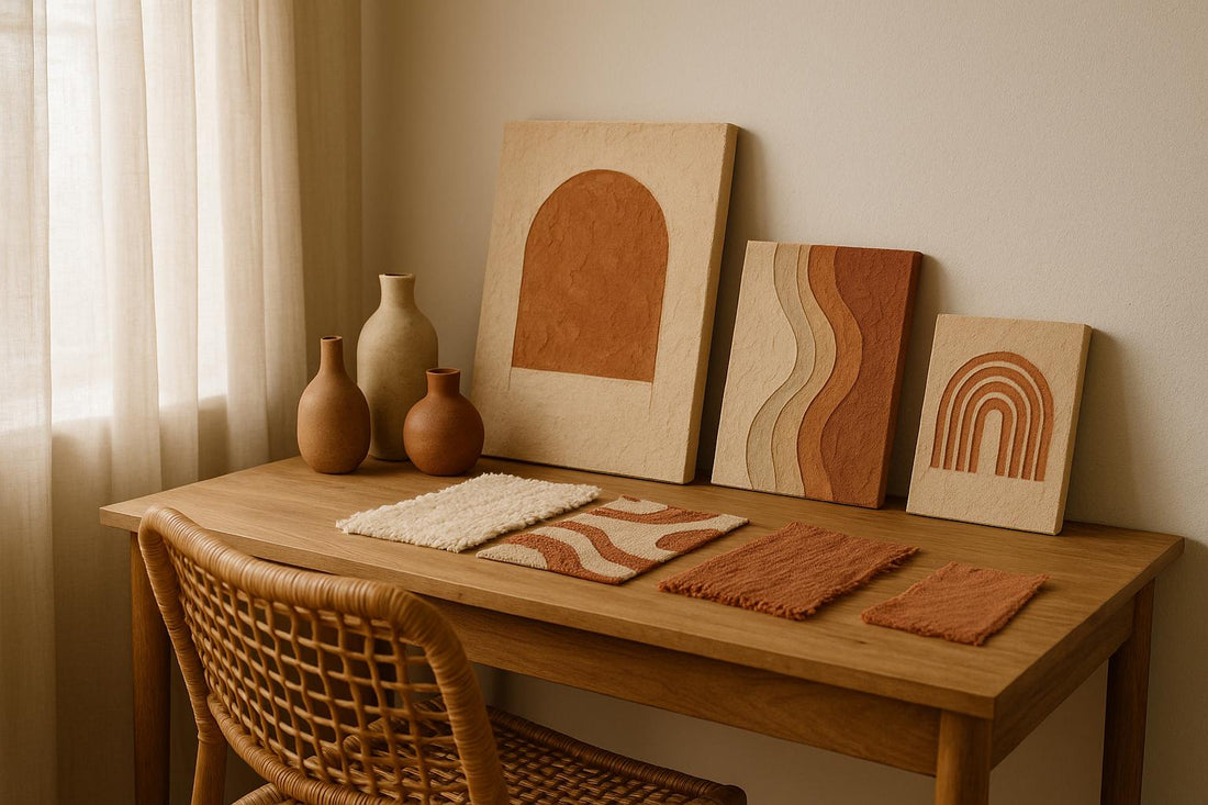
Start with the foundation - large base pieces that anchor your décor. These could be substantial items like jute or wool wall hangings, or oversized canvas prints featuring earthy tones or subtle boho patterns. For example, a 90cm-wide macramé hanging or an A1 canvas print can set the tone for your space.
If you're looking for authentic options, consider OMG Kitty's oversized prints. Their hand-designed pieces embody a boho aesthetic and are sustainably made to order, adding both style and conscience to your décor.
Once you’ve chosen your base piece, position it on the wall and take a step back. Assess how it interacts with your room’s natural light and surrounding furniture. This layer should ground the space without overpowering it.
Add Medium-Sized Textured Elements
Next, bring in medium-sized elements to add personality and depth. Think patterned throws, embroidered cushions, or smaller framed prints. These pieces act as a bridge between the large base and the finer details, creating a cohesive look.
At this stage, mix materials thoughtfully. For instance, pair a chunky knit throw with smooth cotton cushions, or combine geometric patterns with softer, floral designs. The goal is to complement the base layer in both texture and colour, not compete with it.
Extend your textures beyond the wall by draping patterned throws over nearby furniture. You could also arrange medium-sized framed prints next to your base piece for a gallery-style effect. To tie everything together, consider the 60-30-10 colour rule: 60% of your tones should echo the base, 30% can introduce complementary shades, and 10% can add a contrasting pop. This keeps the overall look harmonious while adding visual intrigue.
Complete with Small Textured Details
The final layer is all about the little things. Small accents like tassels, fringe, beads, or embroidered motifs provide the finishing touches that make your arrangement feel polished and intentional.
Distribute these details evenly for balance. For instance, you might add a few beaded tassels or fringe trims to soften bold patterns or to add contrast to a neutral base. Keep it simple - a few well-placed accents can have more impact than an overload of elements. And don’t forget to consider how natural light interacts with these textures; shadows and highlights can add an extra layer of visual interest.
The key here is balance. Let the smaller details enhance your display without making it feel cluttered.
| Layer Type | Recommended Size | Material Examples | Purpose |
|---|---|---|---|
| Base Pieces | 90cm+ width, A1+ prints | Jute, cotton, wool, canvas | Anchor the display |
| Medium Elements | 30–60cm items, A3–A2 prints | Patterned textiles, framed art | Add dimension and personality |
| Small Details | Under 15cm accents | Fringe, beads, tassels | Provide fine texture and completion |
Layering is a process that benefits from patience. Allow each element to settle visually before adding the next. This step-by-step approach ensures your final arrangement feels intentional and effortlessly stylish, capturing that boho charm that makes a space warm and welcoming.
Add Personal Style with Boho Art Prints
Once you've mastered layering textures, boho art prints can bring your space to life. These prints do more than fill blank walls - they become the focal points that tie textures together and reflect your personal style.
The magic of art prints in boho décor lies in their ability to connect different textures effortlessly. For instance, a carefully chosen print might mirror the earthy hues of a jute wall hanging while introducing fresh patterns that complement embroidered cushions. This creates a visually cohesive look that feels intentional and harmonious. To elevate your design, focus on selecting prints that enhance and unify your layered elements.
Use OMG Kitty's Art Prints

When choosing prints for your boho-inspired space, prioritise quality and authenticity. OMG Kitty's collection offers hand-designed prints that embody the boho aesthetic while staying eco-conscious. Their premium giclée printing process ensures vibrant, long-lasting colours that pair beautifully with your curated textures.
These prints come in a range of sizes from A4 to A1, with optional frames to suit your layering needs. An A1 print can act as a bold centrepiece, while smaller A4 prints add those finishing touches. Starting at £24.00, these sustainably made prints arrive ready to integrate into your décor. Plus, with worldwide tracked shipping, your chosen pieces will reach you safely, no matter where your boho retreat is located.
When arranging prints, think about size hierarchy: larger prints serve as anchors, medium ones as transitions, and smaller pieces as accents. This approach ensures your wall art complements the overall layered look.
Make a Gallery Wall
A gallery wall featuring multiple boho prints is a fantastic way to take your texture layering to the next level. It lets you experiment with a variety of sizes, patterns, and themes while maintaining the visual flow of your space.
Play with different arrangements - try clustering three A4 prints around a larger A2 piece or creating a linear display that mirrors the lines of a macramé hanging. Keep spacing in mind: allow 5–10cm gaps between smaller prints and 10–15cm around larger ones for a relaxed, organic feel.
Colour coordination is key when combining multiple prints. Stick to the 60-30-10 rule: let one colour family dominate 60% of your wall, use complementary tones for 30%, and add small pops of contrast in the remaining 10%. This creates balance without overwhelming the eye.
Also, consider how your prints interact with existing textures. If you have a chunky wool throw nearby, opt for prints with softer, subtler patterns to create contrast. On the other hand, if your base textures are understated, bolder and more graphic designs can make a statement.
One of the best things about high-quality prints like those from OMG Kitty is their versatility. You can swap them out seasonally or as your style evolves, keeping your boho aesthetic fresh and uniquely yours.
Conclusion
Layering textures can completely transform a space, using neutral tones as a backdrop for bold patterns and creating depth without overwhelming the design.
Combine contrasting textures - like rough jute paired with smooth ceramics, soft wool alongside structured rattan, or glossy prints against matte fabrics - to add dimension and interest. The process is simple: start with larger foundational pieces, add medium-sized elements, and finish with smaller, detailed accents.
To complement these layers, art prints serve as the perfect finishing touch. They not only unify the various textures but also reflect your personal style. Pieces from OMG Kitty, for example, can seamlessly elevate your design. Whether you choose a standout statement piece or create a gallery wall, these prints help tie the layers together, ensuring a harmonious look.
What makes boho layering so special is its personal nature. There’s no strict formula - your space should be a reflection of your individual style, balancing neutral foundations with creative flair. Every layer you add contributes to a thoughtful and cohesive design.
FAQs
How can I create a balanced look with textures in my boho art decor?
To achieve a well-balanced and visually pleasing boho art decor, try blending bold, detailed textures with softer, more subtle ones. For instance, you can pair woven or macramé pieces with smoother finishes, such as framed art prints or polished surfaces.
Choose a consistent colour palette to unify the space, and play with the scale of textures. Combine larger, statement-making patterns with smaller, more delicate details to create depth without overwhelming the room. Adding natural materials like wood, rattan, or linen can further enhance the boho vibe while keeping the overall look balanced and interesting.
How can I choose art prints that complement the textures in a boho-style design?
To bring out the charm of textures in a boho-style space, consider art prints that highlight natural themes. Think botanical designs, earthy shades, or abstract patterns - they pair wonderfully with textured elements like woven wall hangings, macramé, or patterned rugs.
Blending vintage-inspired pieces with modern prints adds an extra layer of character and intrigue. Choose colours that either complement or gently contrast your existing decor to keep the overall look harmonious. Playing around with varied print sizes can also help achieve that layered, collected feel that’s so integral to the boho vibe.
How can I select the perfect colour palette for a boho-style room while considering my home's lighting?
To design a boho-inspired space that plays beautifully with your home's lighting, start with earthy neutrals like beige, warm white, or soft grey as your foundation. These soft tones create a flexible canvas that works in almost any setting.
If you’re working with south-facing rooms that get abundant natural light, consider layering in vibrant jewel tones such as emerald green, sapphire blue, or deep amethyst. These colours add richness and dimension to the space. For north-facing rooms or areas with cooler light, opt for warmer shades like terracotta, mustard yellow, or rusty orange to create a snug, inviting atmosphere.
The secret to a cohesive boho style lies in blending natural tones with bold, nature-inspired accents. Since lighting can dramatically change how colours look, it’s a good idea to test paint or fabric swatches in the actual room before locking in your choices.