Boho prints can transform your space with their relaxed, eclectic vibe. Here’s how to choose the right ones:
- Focus on Key Features: Look for earthy tones, nature-inspired motifs, geometric patterns, and global influences.
- Match Your Decor: Align prints with your room’s color palette and furniture style.
- Play with Sizes: Cover 60–75% of wall space, and choose sizes that complement your furniture.
- Mix Patterns: Combine large, medium, and small-scale patterns for a balanced look.
- Go Eco-Friendly: Opt for prints made with recycled paper, water-based inks, or handmade designs.
Quick Tips for Placement
- Statement Wall: Use one large print as a focal point.
- Gallery Wall: Arrange multiple prints tightly with 2–3 inches between frames.
- Room Ideas: Add colorful prints above sofas, mandalas in bedrooms, or calming blue tones in offices.
Boho style is about layering textures, embracing individuality, and creating a warm, inviting space. Start with prints that resonate with you and let your personality shine through.
Boho Chic on a Budget: Stunning Wall Art for Small Spaces
What Makes Boho Style
Bohemian style is all about embracing individuality through a mix of vibrant design elements. By understanding its core components, you can choose prints that truly reflect the essence of boho decor.
Key Boho Design Elements
Boho style thrives on an eclectic mix of patterns and textures, creating spaces that feel both relaxed and inspiring. Interestingly, a UCLA study from January 2024 found that rooms featuring bohemian design elements reduced stress levels by 25% and boosted creativity by 15% among participants.
Some defining features of boho design include:
- Mixed Patterns: Blend geometric shapes, floral designs, and tribal motifs for a layered look.
- Layered Textures: Use natural materials and a variety of surface finishes to add depth.
- Organic Elements: Incorporate nature-inspired motifs and textures to bring the outdoors in.
- Personal Touch: Add meaningful symbols or artistic pieces that reflect your personality.
"Boho decor infuses vibrant, eclectic prints into a space for a relaxed, creative atmosphere".
Boho Color Guide
The color palette in boho design is all about balance - combining warm, earthy tones with bold, vibrant accents. Erika Woelfel, a color expert at Behr, explains, "A boho color is all about warm, earthy tones mixed with vibrant accents".
| Color Category | Primary Uses | Impact |
|---|---|---|
| Earth Tones | Base colors, large prints | Creates a grounding effect |
| Jewel Tones | Accent pieces, focal points | Adds drama and energy |
| Warm Neutrals | Background elements | Provides balance |
| Natural Greens | Botanical prints | Brings an organic feel |
Trends suggest that earthy greens will take center stage in 2025, with 48% of design professionals predicting their dominance. These colors reflect boho's roots in global art, blending influences from different parts of the world.
Global Art Influences
Boho style rose to popularity in home decor during the 1960s and 70s, drawing inspiration from art and design traditions worldwide. These influences add depth and character to your space while aligning with your personal aesthetic.
Here’s a closer look at some key cultural influences:
Moroccan Heritage
- Complex geometric patterns
- Rich jewel tones like turquoise and saffron
- Ornate architectural motifs
Indian Artistry
- Intricate mandala designs
- Paisley patterns
- Bold color combinations, such as indigo and fuchsia
Native American Design
- Earth-tone palettes
- Spiritual symbols
- Nature-inspired elements
Pinterest data shows that "Boho art" is a popular search term, with 141,000 people actively looking for it. Current trends highlight arch-shaped designs and bold graphic patterns. By understanding these global influences, you can choose boho-style prints that bring character to every room.
Picking Prints for Your Room
Match Prints with Current Decor
To seamlessly incorporate boho prints into your room, focus on aligning them with your existing decor. Start by identifying the dominant colors in your furniture and textiles, then choose prints that echo these shades for a cohesive look. As Lauren Nelson advises:
"I always pay close attention to the natural light in the space and choose textural elements and wall art that complement and enhance it".
Once you've matched the colors, consider the size of the prints to maintain a balanced and harmonious feel in the room.
Print Size Guide
When it comes to selecting print sizes, aim to cover about 60-75% of the available wall space. Here's a quick guide to help you pair prints with common furniture pieces:
| Furniture Piece | Recommended Print Width |
|---|---|
| Queen Bed | 34" - 45" |
| 96" Sofa | 54" - 72" |
| 60" Table | 34" - 45" |
For a polished look, leave 6-12 inches of space between the top of your furniture and the bottom edge of the artwork. Also, ensure the center of your print is at eye level for the best visual impact.
For larger walls, consider these standard print dimensions:
| Wall Size | Recommended Print Dimensions |
|---|---|
| Small Wall | 16" x 20" or 16" x 24" |
| Medium Wall | 24" x 36" or 30" x 40" |
| Large Wall | 36" x 48" or 40" x 50" |
With your print sizes planned, you can move on to experimenting with pattern combinations to add depth and character.
Pattern Combinations
Achieving a layered and balanced boho aesthetic comes down to three key elements: scale, color, and style. A great way to find inspiration is by reflecting on environments that resonate with you. As one expert puts it:
"Discovering your spirit environment [such as the jungle, beach, or desert] can help to learn the colors, scents, textures, and sounds that light you up and make you feel your best".
When mixing patterns, consider these tips:
- Use large-scale patterns for bold, statement pieces.
- Add medium-scale patterns to complement and support the overall design.
- Include small-scale patterns for subtle, intricate details.
A popular trend for 2025 blends minimalist elements with boho patterns, often paired with metallic accents for a modern touch. To keep things visually balanced, combine larger patterns with smaller ones, creating a dynamic yet cohesive look.
sbb-itb-78c8b21
Eco-Friendly and Handmade Options
Why Choose Eco-Friendly Art?
Eco-friendly boho prints, crafted with recycled paper and water-based inks, offer a way to decorate your space while reducing environmental harm. When shopping for these prints, keep an eye out for these key features:
- FSC-certified paper: Ensures responsible forest management.
- Water-based inks: Minimizes toxic chemical emissions.
- Local production: Cuts down on shipping-related carbon footprints.
Collections like OMG Kitty's embody this commitment to sustainability, making it easier to blend style with ecological awareness.
The OMG Kitty Boho Print Collection

OMG Kitty's boho print collection is a shining example of sustainable artistry. Designed in the UK, their prints are available in sizes ranging from A4 to A1 and are produced using premium giclée printing methods. Their made-to-order approach not only accommodates different room layouts but also reduces energy use and waste, aligning perfectly with eco-conscious values.
Handmade and Custom Print Options
Opting for made-to-order prints is a step toward embracing sustainability. To identify genuine handmade prints, check for slight texture variations and a subtly dull reverse side - hallmarks of authentic craftsmanship. These prints complement the boho aesthetic, which thrives on globally inspired, sustainable design.
"In an age of virtual reality [and] AI, … I think people are starving for reality, including the human body and its time-bound skills and limits. Choosing handmade objects crafted with time-honored skills answers that hunger. These objects are not part of a throwaway 'instant' culture – they have a beauty and touchability that may outlast us. In choosing and using them, the buyer participates in that commitment to reality, to earthy materials like clay, metal, fibers, wood that have been shaped and changed by real human beings and the time they spent making them. It's an antidote to virtual reality and a culture of endless duplication and replacement of the human."
For the best eco-friendly prints, prioritize those made with FSC-approved paper and eco-inks. The growing interest in sustainable art reflects a larger cultural shift, where aesthetics and environmental responsibility go hand in hand.
Print Placement Tips
Once you've chosen your prints and decided on styles, the next step is all about placement. Thoughtful arrangement can take your boho decor to the next level.
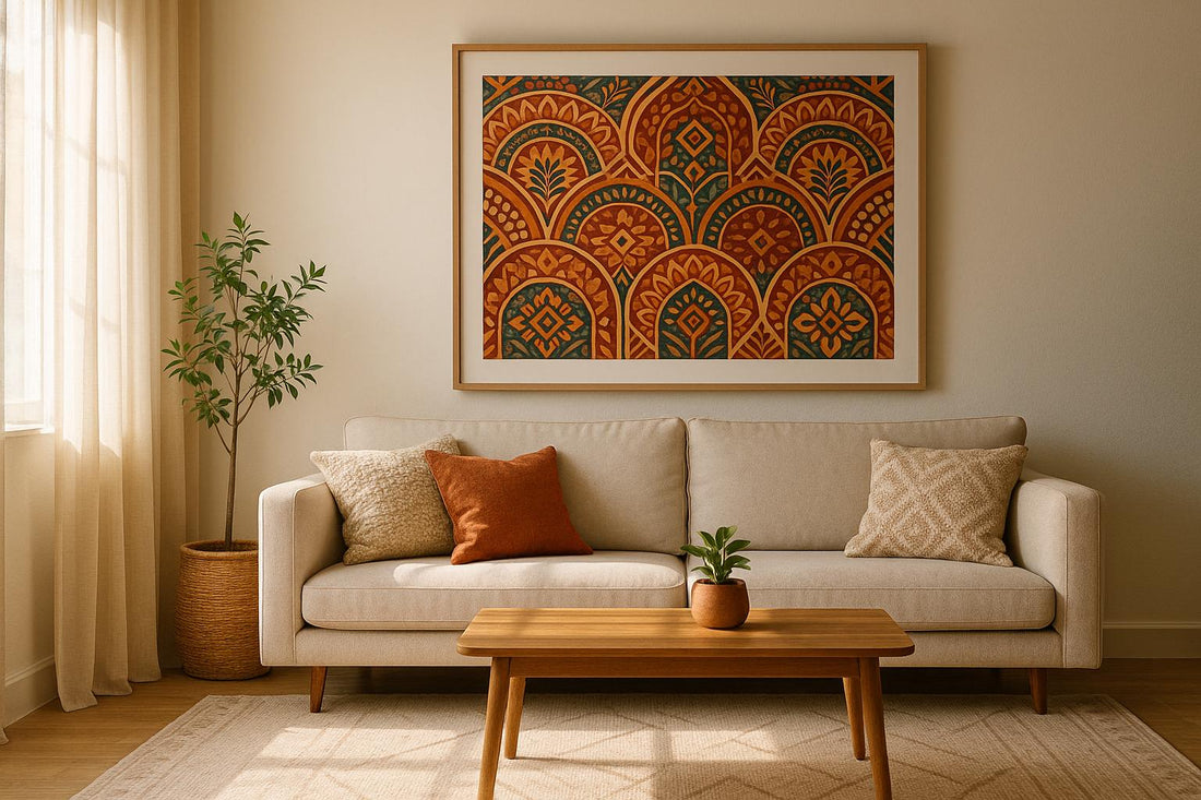
Making a Statement Wall
Pick a focal wall - like the space above your sofa, bed, or mantel - and let it shine with one standout print paired with smaller, complementary pieces. Here’s how to make it work:
- Hang a large print slightly off-center to create visual interest.
- Incorporate textures like woven baskets or macramé for added depth.
- Stick to neutral wall colors such as taupe, tan, ivory, or sage to let the prints pop.
Gallery Wall Setup
Creating a gallery wall takes some planning, but the payoff is worth it. Start by arranging your pieces on the floor to map out your design.
"Gallery walls work great in so many spaces, but there's a lot of planning required. You want to create a thoughtful gallery, not a random hodgepodge." - Taylor Daroci
Key tips for a polished look:
- Space frames 2–3 inches apart for balance.
- Use colors that complement each other, like green, blue, coral, and mustard.
- Keep the layout tight to avoid gaps that can make the arrangement feel disjointed.
"Keep it tight. I like pretty tight seams in between each piece... This is one of the biggest mistakes people make…not putting the art close enough and not using ENOUGH pieces of art." – Sara Janssen
Room-by-Room Print Ideas
Different rooms call for different approaches to print placement. Here are tailored ideas for each space:
Living Room
- Create a focal point by hanging colorful prints above the sofa.
- Layer prints of various sizes for a dynamic look.
- Add greenery with plants in ceramic or stone pots to complement the art.
Bedroom
- Replace a traditional headboard with a mandala tapestry for a boho vibe.
- Hang dreamcatchers near windows for a whimsical touch.
- Use string lights to add soft, ambient lighting.
Home Office
- Opt for blue-toned prints to promote focus and calm.
- Display smaller prints on floating shelves for a clean, organized look.
- Mix vintage and modern pieces to keep the space visually interesting.
Conclusion
Choosing boho prints is a fantastic way to turn your space into a reflection of who you are. Designer Justina Blakeney sums it up perfectly:
"Adding plants is also an instantaneous way to make a home feel more relaxed, colorful, and full of life. It looks good, it's good for the spirit, and it's good for the planet".
Boho design thrives on freedom of expression, layered textures, and rich color palettes. Unlike the rigid uniformity of minimalism, boho style encourages a more relaxed, lived-in vibe. It’s about creating spaces that feel authentic and uniquely yours.
For a polished look, consider these tips: hang artwork at 57 inches from the floor and ensure pieces above furniture span about two-thirds of its width. These small adjustments can make a big difference, turning your art into a defining feature of the room. As Daniel Lee-Jacobs, Director of ArtsHaus, points out:
"When it comes to choosing art for interiors, sadly artwork is often relegated to an afterthought. But if you take the time to find something which truly fits the environment it can be an incredible focal point and discussion piece."
Incorporating sustainable materials into your decor not only enhances your space but also supports a greener planet. Artist Apoorva Hambarde highlights how creativity and a touch of whimsy are at the core of the bohemian aesthetic.
FAQs
How can I add boho prints to a minimalist space without making it feel cluttered?
To incorporate boho prints into a minimalist space, start by using them as subtle accents rather than focal points. Stick to prints that share a cohesive color scheme with your current decor - think neutral tones or muted earthy hues. Select one or two key pieces to avoid crowding the space.
Keep the overall look light and uncluttered by pairing these prints with natural materials like wood, rattan, or linen. You might frame the prints simply or hang them directly on a neutral wall for a clean, understated effect. Striking the right balance between textures and colors will bring warmth and character to your minimalist space without making it feel busy.
How can I select eco-friendly boho prints that match my sustainable lifestyle?
When selecting eco-friendly boho prints, focus on options that are crafted with sustainability in mind. Prints on recycled paper or responsibly sourced materials are a great start. Additionally, choosing designs made with non-toxic, water-based inks helps reduce their environmental footprint.
Consider supporting artists and brands committed to ethical and sustainable practices. Another smart choice? Go for made-to-order prints, which help cut down on waste by avoiding unnecessary overproduction. With a bit of care, you can design a boho-inspired space that’s both chic and planet-friendly.
How can I mix patterns and textures to create a cohesive boho-style space?
To create a boho-style space that feels inviting and well-put-together, focus on blending textures and patterns thoughtfully. Layer materials like cotton, linen, wool, and rattan to bring in warmth and dimension. When it comes to patterns, pair bold, eye-catching designs with subtler ones to maintain balance. Stick to a color palette with a few consistent tones to tie everything together seamlessly.
To capture an authentic boho vibe, include globally inspired touches such as woven textiles, macramé, or handmade decor pieces. Feel free to get creative - boho design thrives on individuality and a laid-back, curated aesthetic. The trick is to mix and match with care, ensuring the space feels eclectic yet cohesive!