Earthy tones like terracotta, olive green, and warm beige can instantly make your boho space feel cozy, calming, and grounded. These colors, inspired by nature, evoke warmth, stability, and creativity, making them perfect for creating a relaxing yet inspiring environment.
Key Takeaways:
- Main Colors: Terracotta, olive green, warm browns, and beige.
- Mood Effects: Promote calmness, balance, and creativity.
-
Design Tips:
- Use earthy tones for walls, furniture, and accents.
- Layer textures (e.g., wood, jute, velvet) for depth.
- Add nature-inspired wall art to tie the look together.
For a quick transformation, pair neutral bases with rich accents like rust or olive, and incorporate natural materials like wood or clay. Wall art, such as botanical prints or abstract landscapes, can complete the look while enhancing the earthy vibe.
Eclectic Boho Living Room Style: A Complete Guide
Understanding Earthy Tones
Earthy tones take their cues from the natural world. In boho design, these colors are the backbone, creating spaces that feel grounded yet effortlessly free-spirited.
Common Earthy Colors
The earthy palette blends warm and cool shades, each tied to nature. Here's how these colors draw from their roots:
| Color Family | Natural Source | Mood Effect |
|---|---|---|
| Terracotta | Clay and pottery | Warmth and comfort |
| Olive Green | Forest foliage | Growth and balance |
| Warm Browns | Wood and soil | Stability and security |
| Desert Beige | Sand and stone | Serenity and calm |
These colors bring unique qualities to a space and can be layered together to add richness and depth. Let’s dive into how they influence your mood.
How Earthy Colors Affect Mood
Earthy tones are known for their calming effects, connecting us to nature and encouraging relaxation. When used in boho interiors, they create a grounded atmosphere that reduces stress and sparks creativity.
Each shade contributes in its own way: browns evoke strength and reliability, while greens symbolize growth and harmony. Together, they form a balanced environment perfect for both unwinding and inspiring new ideas.
You can incorporate these tones through various design elements:
- Wall Colors: Painting walls in earthy tones envelops the room in a comforting vibe.
- Natural Materials: Wood, stone, and clay elements bring the outdoors inside.
- Textiles: Woven fabrics in earthy shades add texture and warmth.
- Wall Art: Nature-inspired prints with earthy palettes tie the design together.
For unique, hand-designed boho wall art, check out OMG Kitty for options that align with this aesthetic.
The beauty of earthy tones lies in their ability to work together seamlessly. When combined thoughtfully, they embody the timeless and free-spirited charm that defines boho design.
Picking Earthy Tones for Your Room
Main Room Colors
Choose warm, neutral shades for walls and large furniture that work well with your room's natural light and features.
Start with neutral tones as a foundation:
| Surface | Suggested Colors | Impact on the Room |
|---|---|---|
| Walls | Warm beige, Soft terracotta | Creates a cozy, inviting feel |
| Large furniture | Camel, Light brown | Brings warmth without overpowering |
| Flooring | Natural wood tones, Desert sand | Grounds the room with natural elements |
Adjust the color intensity based on your lighting - opt for warmer tones in dim spaces and cooler ones in brighter areas. Once your base is set, add layers of accent colors for a complete boho vibe.
Accent and Support Colors
Balance the space with complementary accents:
- Use rich shades like olive green and rust for larger accents, such as throw pillows or rugs.
- Add small pops of color - turquoise, magenta, or metallics - through decor pieces.
- Incorporate nature-inspired art, such as OMG Kitty's eco-friendly boho prints, to tie the palette together.
Combine different textures, like smooth fabrics with rougher materials, to add depth and character to the room.
sbb-itb-78c8b21
Adding Earthy Tones to Your Space
Color Layering Tips
To build depth and mood in your earthy palette, layering is key. Start with large foundational pieces like rugs and curtains, move to mid-sized accents such as cushions and blankets, and finish with smaller decor items.
| Layer | Elements | Suggested Colors |
|---|---|---|
| Base Layer | Area rugs, curtains | Natural jute, terracotta, deep brown |
| Middle Layer | Throw blankets, cushions | Olive green, burnt orange, warm beige |
| Top Layer | Small decor, vases | Muted blues, metallic accents, stone gray |
Mixing different textile weights and textures can bring your earthy palette to life. Add variety with textures and patterns to create a more dynamic look.
Texture and Pattern Ideas
Natural materials are perfect for creating a warm and inviting vibe. Try combining these materials for a balanced and cozy feel:
- Pair smooth leather furniture with rough, textured jute rugs.
- Add soft velvet cushions alongside rattan accessories.
- Use wooden elements with woven wall hangings for a natural touch.
For patterns, go for nature-inspired designs like tribal or geometric prints in earthy tones. Balance is important - use large-scale geometric rugs with smaller floral or intricate patterns in accent pieces.
Want to create contrast? Try these ideas:
- Place smooth ceramic vases on rough wooden surfaces.
- Display woven baskets next to polished stone objects.
- Combine macramé wall hangings with sleek metal frames.
These combinations can add a layered, visually interesting look to your space.
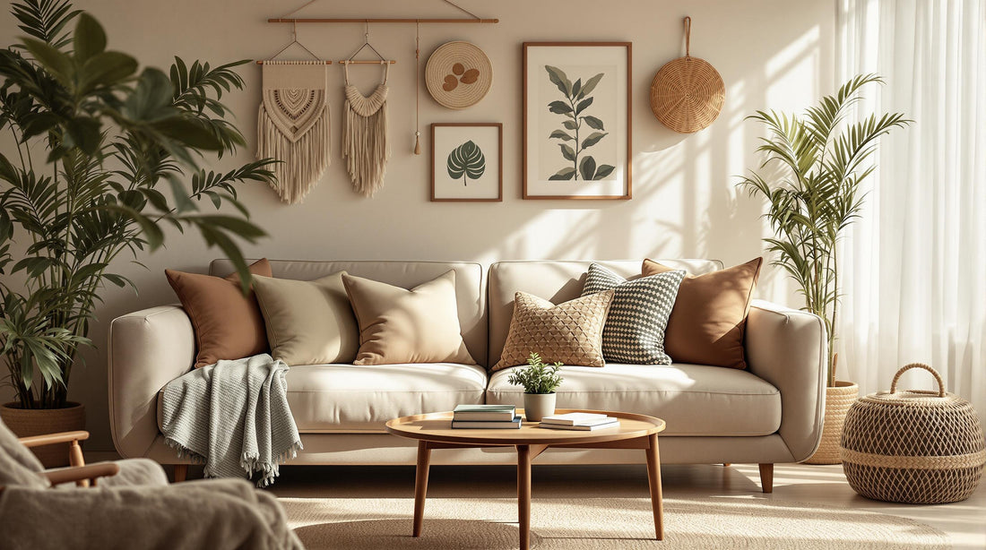
Wall Art in Earthy Tones
Wall art can bring your earthy palette to life. The right pieces not only fill empty walls but also create striking focal points, adding depth and character to your boho-inspired space.
Choosing Nature-Inspired Prints
Pick prints that complement your earthy tones. Look for designs featuring botanical motifs, abstract landscapes, or nature-inspired geometric patterns. These can highlight your room's primary colors while introducing subtle contrasts.
| Print Theme | Key Colors | Mood Effect |
|---|---|---|
| Botanical | Sage green, terra cotta, beige | Relaxing and natural |
| Abstract Landscape | Burnt umber, dusty blue, sand | Grounded and calming |
| Geometric Nature | Rich brown, muted gold, clay | Structured and warm |
Mix up sizes and orientations for added visual interest. A large, bold piece can serve as a centerpiece, while smaller prints bring layers and personality. Arranging prints in odd-numbered groups often works best for a boho vibe.
For inspiration, check out OMG Kitty’s collection - they offer designs that align perfectly with this style.
OMG Kitty's Boho Print Collection

OMG Kitty features eco-friendly boho prints that pair beautifully with earthy interiors. Their collection highlights nature-inspired themes that fit seamlessly with earth-tone palettes.
To display your chosen prints effectively, keep these tips in mind:
- Hang larger pieces at eye level to make them stand out.
- Leave enough space between frames to avoid a cluttered look.
- Balance darker, heavier prints with lighter, softer ones.
- Add texture by pairing smooth prints with textured or rustic frames.
Wall art should enhance your room’s earthy vibe, not overpower it. Aim for a thoughtful arrangement that ties your boho aesthetic together while keeping the atmosphere calm and harmonious.
Conclusion
Create a soothing boho space by incorporating earthy tones like terracotta, burnt orange, and olive green. These colors set the stage for a design inspired by nature and grounded in calmness.
To keep the space balanced, pair warm earth tones with cool neutrals. This approach prevents any single color from overwhelming the room while fostering a sense of relaxation.
Here are some ideas to help you bring this look to life:
| Room Type | Primary Earthy Tone | Complementary Colors | Mood Effect |
|---|---|---|---|
| Living Room | Terracotta | Warm beige, deep brown | Welcoming, social |
| Bedroom | Olive green | Sky blue, sand | Calming, restorative |
| Dining Area | Burnt orange | Muted gold, clay | Grounding, intimate |
Once the colors are in place, focus on layering natural textures like wood, leather, and stone to add depth and character to your design.
Finally, tie the look together with wall art that complements your palette. Choose pieces such as botanical prints, abstract designs, or geometric patterns that enhance the earthy tones and textures without overpowering them.
FAQs
Here’s a quick guide to help you understand and use earthy tones effectively:
What are calm earthy colors?
Calm earthy colors bring a sense of peace and grounding to boho-inspired spaces. These tones, drawn from nature, include:
| Color Family | Shades | Effect |
|---|---|---|
| Browns | Warm beige, taupe, sand | Creates a soothing base |
| Greens | Muted sage, olive, forest | Adds a sense of tranquility |
| Neutrals | Clay, stone, cream | Provides soft balance |
When choosing colors, consider how natural light interacts with your space. South-facing rooms can handle deeper, richer earth tones, while north-facing rooms benefit from lighter, warmer shades. This thoughtful approach ensures your boho space feels balanced and welcoming.
"Earthy tones evoke warmth and stability, promote relaxation, and foster a sense of security."
To amplify the serene vibe, pair earthy tones with natural elements like wood, stone, or woven fabrics. For wall decor, check out OMG Kitty’s sustainably crafted botanical and abstract prints - they’re a perfect match for a boho look. Use these tips to fine-tune your palette and create a cozy, inviting space.