
Bohemian wall art is all about freedom, warmth, and personality. The key to achieving this look lies in the choice of colours. Boho designs often combine earthy tones, vibrant jewel shades, and sunset-inspired hues to create layers of depth and energy. Whether you're creating a calming retreat or a bold, lively space, the right palette can transform your walls.
Key Boho Colour Palettes:
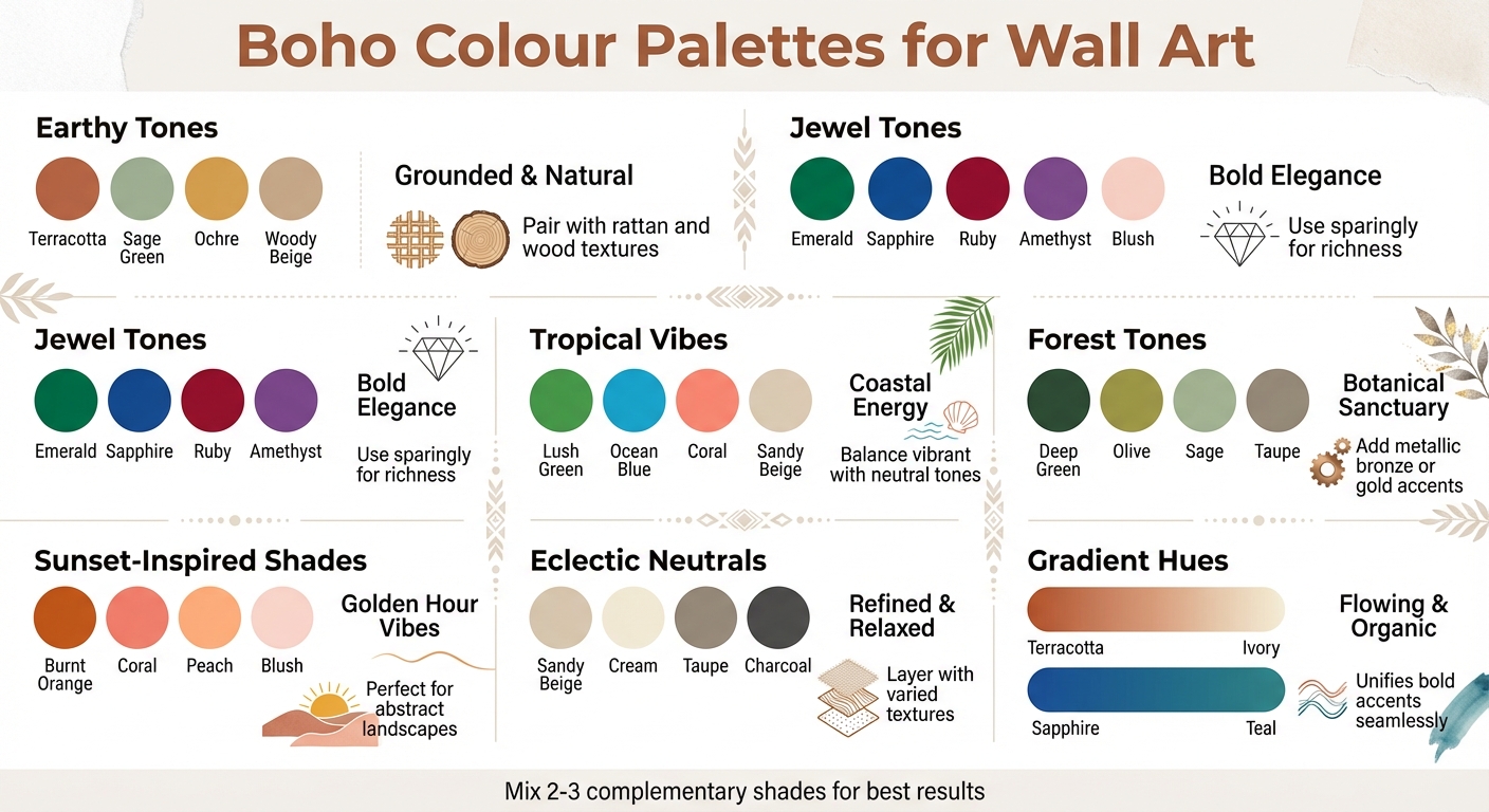
- Earthy Tones: Terracotta, sage green, ochre, and woody beige for a grounded, natural feel.
- Jewel Tones: Emerald, sapphire, and ruby for bold elegance.
- Sunset-Inspired Shades: Burnt orange, coral, peach, and blush for warmth and softness.
- Tropical Vibes: Lush greens, ocean blues, and sunset accents for a coastal touch.
- Eclectic Neutrals: Sandy beige, cream, and taupe layered with soft contrasts.
- Forest Tones: Deep greens and woody neutrals for a botanical sanctuary.
- Gradient Hues: Soft transitions like terracotta to ivory or sapphire to teal for a flowing, organic look.
Quick Tips:
- Pair earthy tones with natural textures like rattan or wood.
- Use jewel tones sparingly to add richness without overwhelming.
- Sunset hues shine in abstract landscapes or multi-panel art.
- Tropical palettes balance vibrant and neutral tones for a fresh look.
- Neutral bases like sandy beige or cream work well with any boho palette.
- Gradient prints can tie together colours and textures seamlessly.
Boho wall art isn't just about decoration - it's about creating a space that feels personal and inviting. Mix and layer colours, textures, and materials to bring your vision to life.
7 Boho Color Palettes for Wall Art with Color Swatches and Styling Tips
1. Earthy Tones
Terracotta, Sage, and Ochre: The Foundation Palette
Earthy tones are the heart of boho wall art, bringing a timeless and grounded vibe to any space. Popular shades like terracotta, rust orange, sage green, mustard yellow (ochre), olive green, deep brown, clay, sand, and woody beige are staples in bohemian interiors. These colours create an instant connection to nature, which is a key element of the boho aesthetic.
These tones evoke feelings of comfort and warmth. As Rose Kigwaini, Content Creator at Magicdecor, puts it:
"Earthy tones allude to comfort, stability, and warmth. Spaces adorned with various earthy tone decorations feel calm and relaxed".
This calming effect makes earthy hues perfect for wall art in spaces designed for relaxation and unwinding.
Sage green is a standout for its versatility, acting as a connector among different tones. Hannah Yeo, Senior Manager of Colour Marketing at Benjamin Moore, explains:
"Like the stem of the flower, a silvery sage seamlessly connects a wide range of colours".
This makes sage green an excellent choice for tying together warmer shades like terracotta and ochre in multi-panel wall art or gallery displays.
When choosing earthy-toned wall art, these colours are a great starting point. Add brighter accents to create depth and interest. Natalie Ebel, Co-founder and Creative Director at Backdrop, highlights the charm of terracotta:
"[Terracotta] adds depth and warmth to any space, making it an ideal relaxed atmosphere".
Pair these earthy shades with neutral backdrops - think cream or light grey - to make the artwork stand out and brighten up the room.
For an even more organic feel, surround your prints with natural materials like rattan, jute rugs, or wooden frames. Layering these textures transforms wall art into a focal point, enhancing the bohemian vibe of the space.
2. Jewel Tones
Emerald, Sapphire, and Ruby: Bold Elegance Meets Boho Charm
Jewel tones like emerald, sapphire, ruby, and amethyst bring a rich and vibrant energy to boho wall art, blending luxury with a free-spirited aesthetic. These deep, saturated colours are perfect for adding bursts of intensity to warmer, earth-toned palettes without overwhelming the overall look. As Colourany beautifully puts it:
"Let the brilliance of emerald greens, sapphire blues, ruby reds, and amethyst purples spark your imagination and bring your artistic vision to life."
To strike the right balance, try pairing cool jewel tones, such as deep blue or emerald, with warm wall colours like taupe, tan, or terracotta. Alternatively, use warmer jewel tones like garnet or citrine as accents against cooler backdrops.
For a modern twist, incorporate metallic accents like brushed gold, bronze, or nickel. These work especially well in celestial-themed designs featuring sapphire or amethyst backgrounds.
To keep the look grounded and cosy, layer in natural textures. Think macramé wall hangings, woven baskets, or fringe rugs. These elements enhance the warmth of jewel tones and create a harmonious boho vibe, as highlighted by design experts. This thoughtful mix of textures and tones paves the way for exploring even more exciting palettes in boho-inspired art.
3. Sunset-Inspired
Burnt Orange, Coral, Peach, and Blush: Golden Hour Vibes for Your Walls
Sunset-inspired colour palettes bring the cosy glow of the golden hour into your home. With shades like burnt orange, coral, peach, and blush, this combination effortlessly creates a sunlit warmth that has become a hallmark of boho interiors for 2025 and 2026. These tones build on earthy and jewel hues, adding a radiant softness that can completely transform a room.
These colours also shine in artistic expressions, especially in abstract landscape pieces. They evoke a sense of calm and serenity. To keep the look balanced, pair them with muted tones like rust orange, dusty rose, or woody beige. As Simply Boho describes it:
"Think burnt orange, coral, peach, and blush – this dreamy palette channels those golden hour vibes."
For an inviting touch, display these colours in living areas or bedrooms. On cool-toned walls like sage green or taupe, let warm artwork take centre stage. On warmer walls, opt for prints with cooler accents to create contrast.
Consider oversized multi-panel canvases (three to five pieces) to make a bold statement on larger walls. Complement the look with linen cushions, light wood frames, and metallic accents like gold or brushed bronze for a sleek, modern feel.
4. Tropical Vibes
Lush Greens, Ocean Blues, and Sunset Accents: Bringing Coastal Energy Indoors
Tropical colour schemes blend soft neutrals with bold, lively tones to create a vibrant yet grounded aesthetic. This combination is perfect for wall art, offering a refreshing twist on boho style while keeping the atmosphere calm and inviting.
Lush greens - like sage, olive, and teal - serve as a calming botanical foundation, inspired by coastal and tropical landscapes. These greens pair beautifully with oceanic blues, ranging from pale aqua to deep indigo, adding a cool, refreshing contrast to the palette. Together, they set the stage for adding warm sunset hues and earthy neutrals.
Introduce sunset-inspired accents such as coral, peach, burnt orange, and mustard yellow, and balance them with neutral tones like sandy beige or warm taupe. This mix ensures the tropical and oceanic colours stand out while maintaining a sense of harmony. To complete the look, layer these vibrant hues over natural textures - think rattan, linen, or light wood - for a balanced boho feel.
When decorating, play with contrast. For example, hang cool-toned tropical prints on warm-toned walls (like terracotta or tan) or vice versa to create visual interest. Pair two or three complementary tropical shades - such as teal and coral - against a neutral backdrop to tie the look together without overwhelming the space.
For an effortless way to bring this coastal energy into your home, check out OMG Kitty’s sustainably crafted tropical prints. Based in the UK, OMG Kitty specialises in premium, hand-designed art pieces that add a distinctive tropical flair to your décor, perfectly aligning with the nature-inspired boho aesthetic.
5. Eclectic Neutrals
Layered Neutrals and Bold Contrasts
After exploring vibrant and bold palettes, let's turn to eclectic neutrals - a perfect choice for creating a refined yet relaxed foundation for bohemian wall art. These tones work together to form a serene backdrop, with a mix of sandy beige, soft white, cream, and warm taupe. These shades not only reflect light beautifully but also evoke a calming, coastal vibe. To add more character, consider incorporating softer hues like moss green or peach, which complement the classic neutral base.
"Organic tones like sage and moss green, beige, taupe, and peach are perfect for creating a bohemian vibe. Neutrals are staple shades for a boho space, and it's easy to see why." - ElephantStock
To avoid a flat or overly uniform look, contrast is key. Adding elements like cream, grey, black, and wood tones can bring depth and interest. As Annie Quigley from Hunker suggests:
"Layer in cream, grey, black, and wood tones - just be sure to mix and match lots of texture and patterns to keep it unexpected."
This strategy allows you to incorporate darker shades such as charcoal and black, along with natural wood tones and metallic accents like gold or brass. These additions enhance the global, eclectic aesthetic while preserving the warm, organic feel that defines bohemian design.
Texture plays a crucial role when styling neutral wall art. Pair prints with macramé hangings, linen throws, rattan details, or woven baskets to build layers of depth. Monochromatic layering - using variations of a single neutral shade across different textures - can create a cohesive yet visually engaging look.
Begin with a base of sandy beige and cream, then introduce one or two complementary tones like sage or terracotta. Balance these with contrasting elements such as charcoal or metallic accents. Opt for oversized prints to anchor the space amidst the varied textures. For instance, OMG Kitty's hand-designed neutral prints offer a polished touch that ties everything together. These prints, sustainably crafted in the UK, are available in sizes from A4 to A1 and come framed or unframed to suit your styling preferences.
sbb-itb-78c8b21
6. Forest Tones
Deep Greens and Woody Neutrals for a Botanical Sanctuary
Forest tones bring the calming essence of nature into your home, creating a serene, plant-inspired retreat. This colour palette revolves around rich greens like sage, olive, and deep forest shades, complemented by woody neutrals such as taupe, tan, and beige. These hues are a perfect match for bohemian-style interiors, enhancing the earthy, natural vibe mentioned earlier. As Simply Boho explains:
"Green is always in when it comes to boho interiors, and this summer, sage and olive are having their moment. These shades bring a soothing, botanical feel and pair beautifully with neutral or terracotta tones."
To make the most of this palette, it’s important to balance these tones with contrasting warm and cool elements.
For instance, when incorporating forest tones into wall art, consider how the colours play off each other. Cool greens in artwork can be beautifully offset by warmer wall shades like tan or taupe. Deep green tones add richness to abstract landscapes, while sage serves as a soft, neutral backdrop for walls. To emphasise the natural theme, try layering botanical prints with macramé hangings or woven textures for added depth.
To elevate the look, incorporate metallic accents such as brushed bronze or gold alongside deep green prints. This pairing adds a touch of elegance while keeping the overall feel grounded and earthy. Abstract landscapes featuring cool greens are particularly popular right now, embracing the "bring the outside in" trend. For a standout feature, consider OMG Kitty’s hand-designed botanical prints. Available in sizes from A4 to A1, these sustainably crafted pieces celebrate nature’s colour palette. Framing them in natural wood further enhances the forest-inspired aesthetic, making them a perfect fit for bohemian interiors.
7. Gradient Hues
Soft Colour Transitions for a Flowing, Organic Look
Gradient hues bring a sense of motion and harmony to boho wall art, mirroring the soft shifts found in nature. Instead of sharp contrasts, these gentle transitions create a soothing, organic vibe that pairs beautifully with the layered textures often seen in bohemian interiors. As Elephant Stock puts it, "A single-shade washed over your space is a hot trend for 2025."
Expanding on earlier colour palettes, gradient hues offer a seamless way to blend distinct tones. The key to effective gradient wall art lies in natural, well-matched transitions. Think desert-inspired gradients that flow from terracotta to burnt orange and then to soft ivory - ideal for adding warmth. Or consider oceanic palettes that shift from sapphire blue to teal and turquoise, bringing a cooler, refreshing feel. For a more dramatic touch, gradients like deep aubergine fading into burgundy can set a romantic mood.
Gradient prints can also act as a bridge between different design elements. For instance, a sunset-inspired gradient can tie together bold terracotta furniture and neutral beige walls, creating a cohesive, flowing look. These dreamy palettes evoke the golden hour, adding a soft glow to any space. Pairing unframed gradient canvases with textured accents enhances the layered, bohemian aesthetic.
For a modern take, try analogous combinations such as sage-to-mustard or sapphire-to-turquoise. These harmonious gradients shine in larger print sizes, where the transitions have room to unfold naturally. OMG Kitty’s hand-designed gradient prints offer eco-friendly options that beautifully capture these fluid colour stories. They effortlessly unify bold accents and natural textures, making them a perfect fit for any boho-inspired space.
BOHO DECOR TIPS | BOHEMIAN INTERIOR DESIGN | PAINT COLORS
Conclusion
Boho-inspired colour palettes bring warmth and personality to any interior. From earthy terracottas and jewel-toned sapphires to sunset gradients and tropical greens, these combinations embrace the free-spirited essence of bohemian design. As Rose Kigwaini beautifully puts it:
"The beauty of using boho colors for your home decoration is the freedom. You can mix and match until you get a combination that makes you happy and at home."
The charm of boho palettes is their flexibility - they can be tailored to suit your personal style. Maybe you’re drawn to the grounding richness of forest tones or the gentle flow of gradient hues. Start with a neutral base like sandy beige or soft white, then layer in 2–3 complementary shades through wall art, textiles, or natural accents to bring the look to life.
These palettes don’t just decorate a space - they transform the entire mood of your home. Striking a balance between warm and cool tones lets you create a setting that feels both cohesive and uniquely yours.
And for that perfect finishing touch, OMG Kitty offers hand-designed prints that can seamlessly tie your colour story together. Available in sizes ranging from A4 to A1, these eco-friendly options work beautifully framed or unframed, adding a sustainable flair to your bohemian vision.
Bohemian design invites you to break away from traditional rules and craft spaces that reflect your individuality. It’s about creating a home that feels as unique and vibrant as you are.
FAQs
How do I combine bold jewel tones with earthy colours in boho wall art?
To create a harmonious blend of bold jewel tones and earthy colours in boho wall art, aim for a palette that feels both vibrant and grounded. Start with earthy shades like terracotta, olive green, ochre, or beige for about 60% of your colour scheme. These tones provide a warm, natural foundation. Then, introduce muted hues such as sage, dusty rose, or mustard for around 30%, which help create a smooth, balanced transition. Finally, use jewel-tone accents like sapphire, emerald, or ruby sparingly - about 10% - to bring in depth and richness.
When selecting prints, look for designs that naturally combine these tones, or pair neutral artwork with smaller, bold statement pieces. Wooden or bamboo frames enhance the organic vibe, while metallic frames can draw attention to the jewel tones. To tie everything together, layer in textures like woven baskets, macramé, or a soft rug in earthy shades. This combination ensures your walls exude a lively yet cohesive boho aesthetic.
What textures pair well with sunset-inspired boho colour palettes?
Sunset-inspired boho colour schemes - think rich reds, warm oranges, terracotta, blush pinks, and golden yellows - pair wonderfully with natural, textured materials. Elements like reclaimed wood, rattan furniture, and woven jute or sisal rugs bring a grounded, earthy vibe. To soften the look, layer in linen curtains, cotton throws, and macramé wall hangings. For a touch of elegance, consider adding velvet cushions or a faux-fur throw here and there.
Creating depth is all about thoughtful layering. Start with a natural fibre rug as your foundation, then introduce soft, flowing drapes, and finish with handcrafted details like macramé pieces or distressed ceramics. The combination of raw, organic materials and cosy, tactile fabrics complements the vibrant sunset tones, resulting in a warm, eclectic bohemian atmosphere.
How do gradient colours enhance boho-style wall art?
Gradient colours, often achieved through soft transitions like ombré effects, bring a touch of elegance to the boho aesthetic. By blending warm, earthy shades with cooler tones, these transitions mimic the beauty of natural landscapes - think sunlit deserts or serene ocean horizons. This gradual shift in colour adds a sense of depth and movement, creating a layered and flowing appearance that feels organic and calming, rather than the harshness of solid blocks.
In boho interiors, where earthy tones like terracotta or beige are often paired with accents such as olive green or dusty pink, gradients serve as a perfect connector. They seamlessly tie together contrasting colours, reflecting the textured and layered elements that define boho décor - like woven fabrics and raw, natural materials. The result is a balanced, relaxed atmosphere that captures the free-spirited essence of bohemian style.