Creating a gallery wall isn’t just about hanging artwork - it’s about how you arrange the space around each piece to create balance and avoid visual clutter. Negative space, or the gaps between pieces, is key to ensuring your wall feels organized and inviting. Here's a quick summary of how to use negative space effectively:
- Choose a focal point: Start with an anchor piece and give it extra room to stand out.
- Keep spacing consistent: Use even gaps (2–4 inches) for a polished look.
- Use mats and frames: Add breathing room with wide mats or simple frames.
- Experiment with layouts: Try dynamic arrangements to create movement.
- Match the room size: Adjust spacing and the number of pieces based on your wall and room dimensions.
Design Expert's Guide To The Perfect Gallery Wall | Tricks of the Trade
How Negative Space Works in Gallery Wall Design
Negative space isn’t just empty space - it’s a purposeful design choice that shapes your gallery wall and directs attention. How you use it can make your wall feel either serene and refined or cluttered and chaotic.
Think of negative space as the pauses in a melody. These gaps give each piece of art room to breathe, which is especially important when showcasing bold or intricate designs that need space to stand out.
Minimal vs. Eclectic Styles
The amount of negative space can completely change the vibe of your gallery wall. Minimalist designs lean on generous spacing - around 4 to 6 inches between frames - to create a clean, airy feel. These layouts often feature fewer pieces, giving each artwork the spotlight it deserves.
On the other hand, eclectic styles pack more personality with tighter spacing of 2 to 3 inches. While the gaps are smaller, they’re still essential to avoid a chaotic look. Here, negative space acts like glue, bringing together a mix of sizes, colors, and styles into one cohesive display.
| Style | Spacing Distance | Visual Effect | Best For |
|---|---|---|---|
| Minimal | 4–6 inches | Calm, airy, focused | Statement pieces, tranquil spaces |
| Eclectic | 2–3 inches | Energetic, layered feel | Mixed collections, lively rooms |
Some designers even blend minimalist and detailed pieces - like pairing subtle gray-on-gray prints with more vibrant art. By keeping the spacing consistent, the negative space creates a rhythm that feels both fresh and timeless.
Consistent spacing isn’t just about aesthetics; it provides the breathing room that makes each piece shine.
Visual Breathing Room
Properly planned gaps are key to avoiding visual clutter. Without enough space, the artwork can feel cramped, making it harder to focus on individual pieces and causing unnecessary tension.
This becomes even more important in smaller rooms or narrow walls, where overcrowding can quickly overwhelm the space. In compact areas, fewer pieces with 4 to 5 inches of spacing can help maintain balance and keep the design elegant.
Spacing also enhances the impact of standout pieces. For example, an anchor artwork benefits from extra breathing room, drawing the eye and solidifying its role as the focal point of the wall.
Even the wall color plays a role. Dark walls emphasize the spaces between frames, creating bold contrasts that make the art pop. Meanwhile, lighter walls soften the look, giving the collection a floating, almost weightless quality.
5 Tips for Using Negative Space
Understanding how to use negative space can take your gallery wall from average to eye-catching. Here are five practical tips to help you create a polished, visually engaging display.
Choose an Anchor Piece
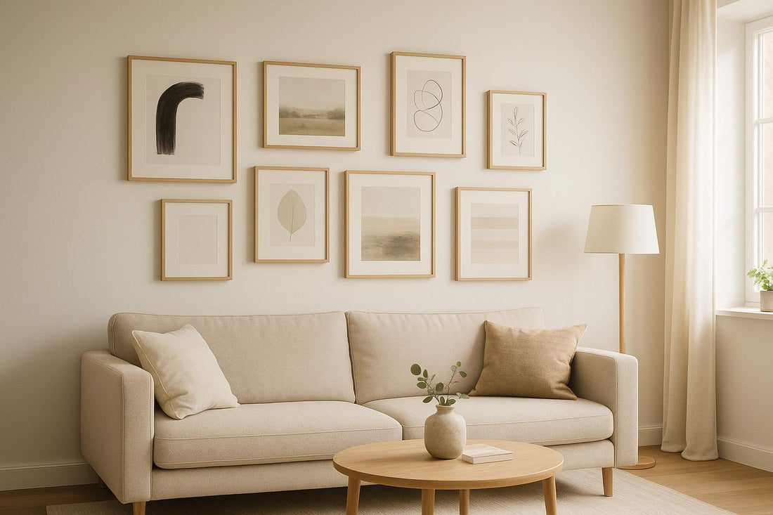
Start by picking a standout piece to set the tone - whether it’s a bold abstract painting, a striking black-and-white photograph, or a vibrant print. Place this anchor piece slightly off-center to encourage the eye to move across the arrangement rather than staying fixed in one spot. Once positioned, give this piece enough breathing room so it can truly shine.
Keep Spacing Consistent
After placing your anchor piece, focus on maintaining even spacing between all the elements. Consistent gaps are key to achieving a clean, professional look. Decide on a specific spacing - typically 2 to 4 inches - and stick to it. To plan your layout, you can use floor mock-ups or paper templates to experiment before hanging. For accuracy, use a ruler and pencil to mark the spots. While 2 to 4 inches is a common guideline, feel free to tweak it based on your wall size and personal style.
Use Mats and Frames to Create Breathing Room
Frames and mats can add an extra layer of negative space, giving your art room to breathe. Wide white or cream mats can create a visual pause, while simple frames - like thin black, natural wood, or white - keep the focus on the artwork itself. Light-colored walls can enhance this effect, making the pieces appear to float and adding an airy feel to the display. Mixing matted and unframed pieces can also introduce subtle texture differences while keeping the arrangement cohesive.
Try Asymmetric Layouts
If you want something more dynamic, consider an asymmetrical layout. Perfect symmetry isn’t always necessary. Start with your anchor piece off-center, then arrange other pieces of varying sizes and shapes around it. Slightly uneven gaps can create a more organic and lively look. Think of the empty spaces as visual breaks, much like white space in graphic design, which helps each piece stand out.
Adjust for Room and Wall Size
Your gallery wall should fit the proportions of your space. In larger rooms, you can go for a denser arrangement with tighter spacing, while smaller rooms or narrow hallways benefit from fewer pieces and wider gaps to avoid feeling cramped. Also, consider the room’s purpose - a bedroom might call for more open space to create a calming vibe, while a family room can handle a busier, denser layout. Tailor your design to the room’s size and function for the best results.
sbb-itb-78c8b21
Using OMG Kitty Art Prints for Gallery Walls

OMG Kitty's hand-designed, boho-inspired prints bring a harmonious touch to gallery walls, allowing each piece to shine individually while maintaining a smooth visual flow that ties the entire arrangement together.
Made-to-Order Prints
When it comes to gallery walls, high-quality prints make all the difference. OMG Kitty's premium giclée prints deliver vibrant, consistent colors and sharp details across all pieces, which is essential for maintaining clean, intentional negative space. After all, uneven quality or unexpected color mismatches can throw off the balance of your design.
For a well-structured gallery wall, start with a large A1 print as your focal point. Surround it with smaller A4 and A3 pieces, keeping 2- to 4-inch gaps between them to give each piece room to breathe. These prints are made to order in a variety of sizes - A4, A3, A2, and A1 - starting at $24.00, ensuring every piece is crafted with care and precision.
Framed and Unframed Options
Choosing between framed and unframed prints can help fine-tune the overall vibe of your gallery wall. Framed prints, especially those with white or natural wood frames, offer a polished look and create extra breathing room with matting. On the other hand, unframed prints lend a more casual, organic feel - perfect for boho-inspired or colorful designs.
If you're going for an asymmetric layout, use framed pieces to add visual weight and balance. For instance, a framed anchor piece can be paired with unframed prints to create a dynamic yet harmonious arrangement. With OMG Kitty's stellar reputation - reflected in a 5-star rating and over 200 glowing reviews - you can trust that each piece will arrive looking exactly as you envisioned.
Conclusion
Mastering the use of negative space can elevate your decorating skills from amateur to professional, especially when it comes to creating gallery walls. These five tips lay the groundwork for achieving a balanced and intentional design that avoids feeling cluttered or overwhelming. Start by choosing an anchor piece to establish your visual foundation, and ensure consistent spacing to give each artwork room to stand out. Incorporating strategic use of mats and frames introduces additional negative space, while asymmetric layouts inject a sense of energy. Finally, adjusting for your room size ensures the arrangement feels just right for your space.
Negative space plays a crucial role in guiding the eye, creating visual hierarchy, and preventing chaos. By maintaining uniform spacing of 2 to 4 inches between pieces and leaving deliberate breathing room around your anchor, you allow each artwork to shine while keeping the overall composition harmonious.
To complement these design principles, using high-quality art pieces is essential. OMG Kitty's premium giclée prints provide the consistent quality needed to achieve this polished look, offering a variety of sizes to help refine your gallery wall's balance.
"I ordered a personalised print and I am blown away by how beautiful it is! The paper and print quality are excellent and the design itself is even more beautiful in person."
– Trustpilot Reviews
With this level of quality, every piece enhances the thoughtful design created through careful use of negative space. Vibrant colors and sharp details ensure that each artwork contributes to the overall visual flow, commanding attention where needed. By combining these design tips with expertly crafted prints, your gallery wall can become a showcase of intentional and sophisticated design.
FAQs
How do I choose between a minimalist or eclectic gallery wall style?
Deciding between a minimalist or eclectic gallery wall depends entirely on your style preferences and the vibe you want to bring to your space.
A minimalist gallery wall focuses on simplicity and balance. It typically includes fewer pieces, matching frames, and a unified color scheme, giving your room a clean, modern, and tranquil feel. In contrast, an eclectic gallery wall thrives on variety and individuality. It mixes frame styles, artwork sizes, and bold designs, creating a lively and energetic atmosphere.
If you’re drawn to a calm, orderly look, a minimalist approach might be your best bet. But if you love decor that’s bold, full of character, and tells a story, an eclectic style is perfect for you!
How can I keep the spacing even when designing a gallery wall?
When creating a gallery wall, keeping the spacing even is key to achieving a neat and balanced appearance. Use a ruler or painter's tape to measure and mark consistent gaps between the frames. To perfect the layout, arrange your artwork on the floor first. This allows you to play around with the positioning and make any adjustments before committing to hanging them. A little planning goes a long way in creating a visually pleasing and harmonious display.
How does wall color impact the use of negative space in a gallery wall?
Wall color has a huge influence on how we perceive negative space in a gallery wall. For example, darker walls create a bold contrast with light-colored artwork, making the empty spaces between pieces stand out more prominently. On the flip side, lighter walls give off a softer, more open vibe, almost making the artwork seem like it’s floating.
If your goal is to make a room feel bigger and more open, stick with lighter or cooler wall colors. These shades amplify the sense of negative space, giving the room an airy, expansive feel. On the other hand, darker walls can make a space feel cozy and intimate, though they might downplay the visual effect of negative space.