Colors influence emotions and the feel of a room. Use these 5 tips to select wall art that matches your space's purpose and mood:
- Blue: Calms and soothes. Ideal for bedrooms or meditation areas.
- Yellow: Energizes and inspires creativity. Perfect for offices or studios.
- Green: Creates balance and a natural vibe. Works in living rooms or reading spaces.
- Earth Tones: Adds warmth and coziness. Great for dining or family rooms.
- Purple: Brings elegance and luxury. Best for offices or artistic spaces.
Quick Overview of Color Effects
| Color | Impact | Best Rooms |
|---|---|---|
| Blue | Calm and tranquil | Bedrooms, bathrooms |
| Yellow | Energizing and creative | Offices, studios |
| Green | Balanced, natural feel | Living rooms, hallways |
| Earth Tones | Warm and inviting | Dining rooms, family areas |
| Purple | Elegant and luxurious | Offices, creative spaces |
Start with these tips and align your art choices with your room's color scheme and lighting to create the perfect vibe.
Color Psychology 101: How to Choose the Perfect Palette for Every Room
Color Psychology Core Concepts
Choosing the right wall art isn't just about style - it's about how colors influence emotions and set the tone for your space. Different hues can completely change a room's atmosphere, so picking artwork that matches your desired mood is key.
What Colors Mean
Colors in wall art can shape the way a room feels. Here's a quick guide:
| Color | Impact on Your Space | Best Rooms |
|---|---|---|
| Blue | Promotes calm and tranquility | Bedrooms, bathrooms, meditation areas |
| Yellow | Boosts energy and sparks creativity | Kitchens, studios, workspaces |
| Green | Evokes balance and a natural feel | Living rooms, reading nooks |
| Earth Tones | Adds warmth and a grounded vibe | Dining rooms, family spaces |
| Purple | Suggests luxury and creativity | Home offices, artistic spaces |
Color Pairing Effects
Pairing colors in wall art can enhance their emotional impact and tie the room's design together. Thoughtful combinations create specific moods:
- Blue + Green: A calming, nature-inspired feel - ideal for relaxation.
- Yellow + Orange: High-energy vibes, perfect for social or creative spaces.
- Earth Tones + Green: A balanced, grounded atmosphere for common areas.
- Purple + Neutrals: A touch of elegance without overpowering the space.
When selecting wall art, think about how it complements your room's colors. Softer shades tend to be calming and versatile, while bold tones can make a statement when used intentionally [1][2].
With these color insights in mind, you're ready to dive into tips for choosing wall art that matches your vision.
sbb-itb-78c8b21
5 Tips for Choosing Wall Art Colors
Now that you’re familiar with the basics of color psychology, let’s dive into how you can use these ideas to choose wall art that fits your home’s vibe.
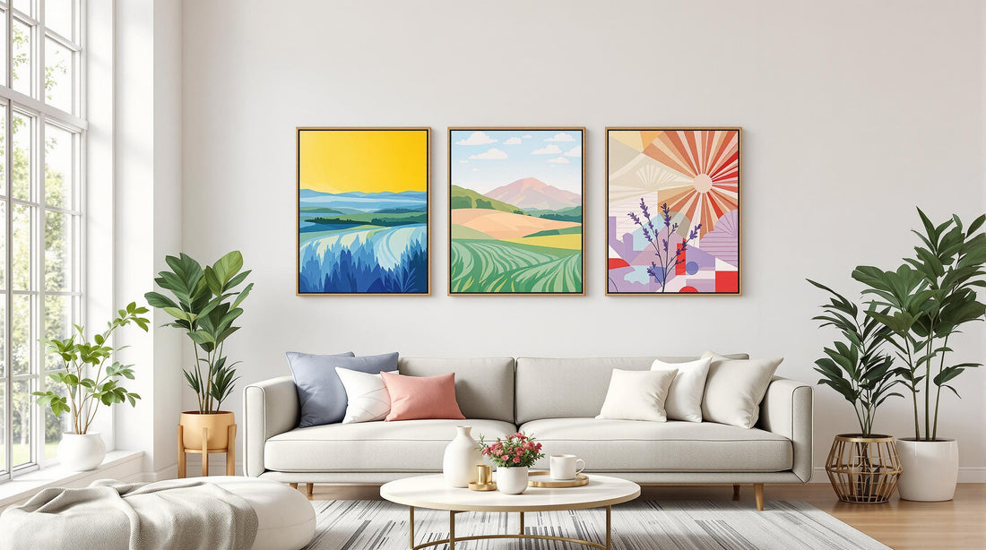
1. Blue Art for Relaxation
Blue artwork adds a calming touch, making it a great choice for bedrooms or meditation spaces. Think of deep ocean views or abstract skies in soft blue tones to create a soothing environment.
Pair blue art with neutral furniture to keep the space serene. A bold blue piece can act as a centerpiece without overwhelming the room. Place it where you’ll naturally see it during moments of relaxation, like across from your bed or near your favorite reading spot.
2. Yellow Art for a Boost of Energy
Yellow wall art is perfect for energizing spaces like home offices or creative studios. Bright sunburst designs or bold geometric patterns can add vibrancy and sophistication.
Hang yellow art where it catches natural light - it’ll amplify its uplifting effect and help you stay focused during busy days. To keep the room balanced, pair yellow with neutral tones.
3. Green Art for a Natural Feel
Green wall art brings a refreshing, outdoorsy vibe to your space. Botanical prints or nature-inspired photography work especially well in living rooms or hallways. Look for shades ranging from soft sage to deep forest green.
Pieces featuring organic shapes or earthy patterns often work best. Combine green with warm neutrals to create a grounded, harmonious feel.
4. Warm Earth Tones for Coziness
Earth-toned artwork instantly makes a room feel inviting. In dining areas or family rooms, try pieces with desert landscapes or abstract designs in browns and terracotta hues. These colors encourage a sense of comfort and connection.
Opt for art that blends multiple warm tones to add richness and depth to your space.
5. Purple Art for a Touch of Elegance
Purple wall art adds a hint of luxury and works well in home offices or creative spaces. Think galaxy-inspired designs or abstract pieces with bold purple accents. Place purple artwork where it’s easily visible from different angles to maximize its visual impact.
Since purple often feels luxurious, it’s best used sparingly and in spaces where it can stand out without competing with other colors.
When choosing wall art, take into account your room’s natural lighting and existing color palette. The right piece will not only enhance the room’s purpose but also tie everything together in a way that feels just right [1][2].
Once you’ve nailed down the colors that work for your space, it’s time to find art that makes your vision a reality.
Where to Buy Quality Wall Art
Now that you know how to pick the right wall art colors, let’s dive into where you can find pieces that stand out.
OMG Kitty Art Collections
OMG Kitty specializes in bold boho-style designs inspired by color psychology. Their prints come in sizes ranging from A4 to A1, so you can easily find something that fits your space. Prices start at $24.00, and every print is made to order in the UK using eco-friendly methods.
What sets OMG Kitty apart is their attention to color accuracy. Their prints ensure calming blues stay soothing and energizing yellows remain vibrant - key factors we covered in the color selection tips. You can also choose from various framing options to match your room’s decor, making it simple to create a cohesive look.
Supporting Independent Artists
Buying from independent artists is a great way to find artwork with one-of-a-kind color schemes. Platforms like Etsy feature thousands of artists offering original pieces across a wide price range, typically between $20 and $200. This makes it easy to discover artwork that fits both your budget and your desired mood.
For a more polished look, check out Minted. They curate collections from independent artists, offering limited-edition prints priced between $20 and $500. These pieces often feature refined color combinations that are perfect for formal settings or home offices.
| Platform | Price Range | Best For |
|---|---|---|
| OMG Kitty | $24 - $100 | Boho-style, eco-friendly prints |
| Etsy | $20 - $200 | Unique, handmade artwork |
| Society6 | $15 - $100 | Modern, trendy designs |
| Minted | $20 - $500 | Limited-edition, gallery-quality |
Before buying, always review the print details and materials. Look for terms like giclée printing or archival-grade, which signal higher quality and better color longevity. This ensures your art will maintain its visual impact and emotional resonance over time [3].
These options make it easy to find wall art that complements your design goals while adding a personal touch to your space.
Conclusion
Using color psychology to choose wall art can influence your emotions and how you interact with your living spaces.
Key Takeaways
Colors have different effects on our surroundings: blue brings calm, yellow boosts energy, green promotes balance, earth tones provide comfort, and purple adds a touch of sophistication. When picking art, think about the room's purpose. For instance, a home office might benefit from energizing tones to improve focus, while green shades in living areas can encourage a sense of harmony [1]. Understanding these ideas can help you select artwork that complements both your mood and your design goals.
The trick is blending color psychology with your personal taste. While these principles offer a helpful guide, your unique connection to the artwork ensures it feels right for your home. There’s no shortage of options that combine scientific insights with individual style [3].